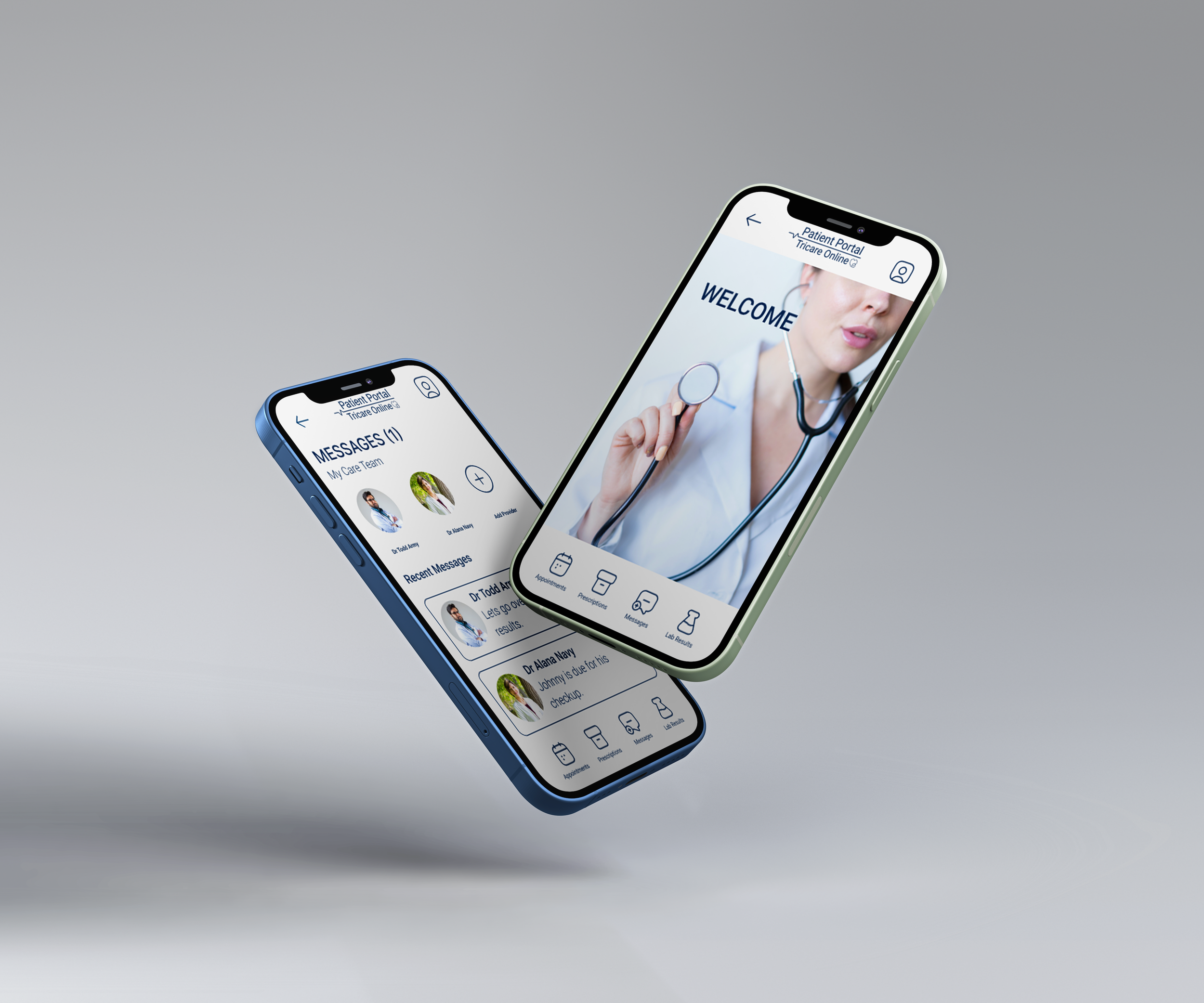
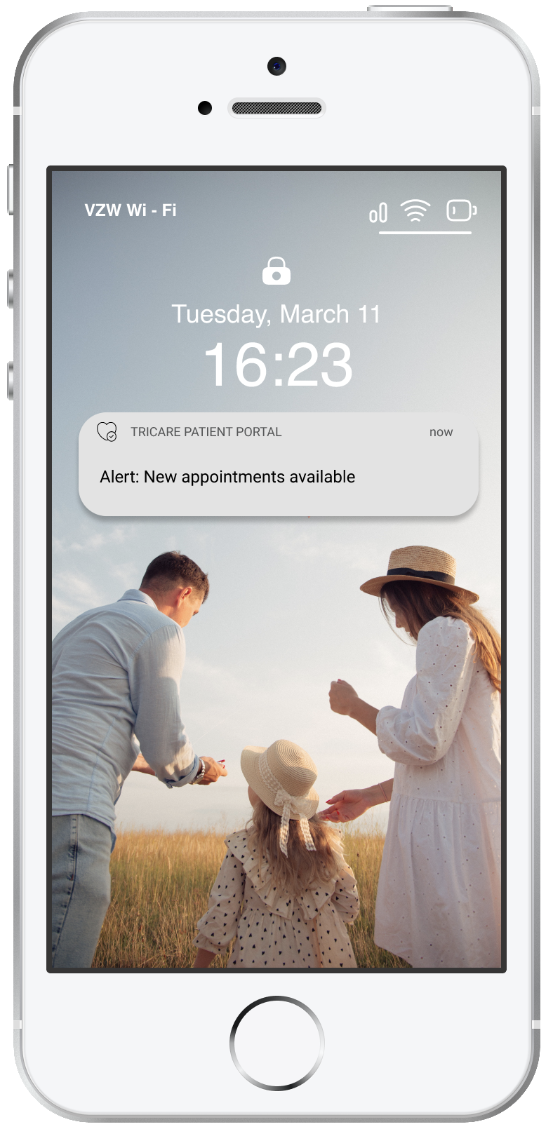
Tricare Online Patient Portal App
A conceptual app design of the Tricare Online Patient Portal
Conceptual Design | Mobile App | UX Research | Visual Design | Figma | Adobe Photoshop | Tally | Octopus.do | March 2023
The problem: Military servicemembers and their families have to use the Tricare Online Patient Portal to book appointments, refill prescriptions, message their doctor, and access medical records/test results. The website is extremely difficult to use with poor responsive design, making it hard for people to utilize the basic features of the portal. Many servicemembers I spoke with have all but given up trying to use the portal, and instead opt for calling the clinic or appointments line and are subjected to long wait times.
The solution: The Tricare Online Patient Portal app was designed to give servicemembers and their families a streamlined, user friendly option to access/utilize their healthcare. The targeted users for the TOPP app are military members and their adults dependents.
Military members and their families wanted an app for the Tricare Patient Portal where they could easily book appointments, request prescriptions, message their care team, and access lab results.
Research
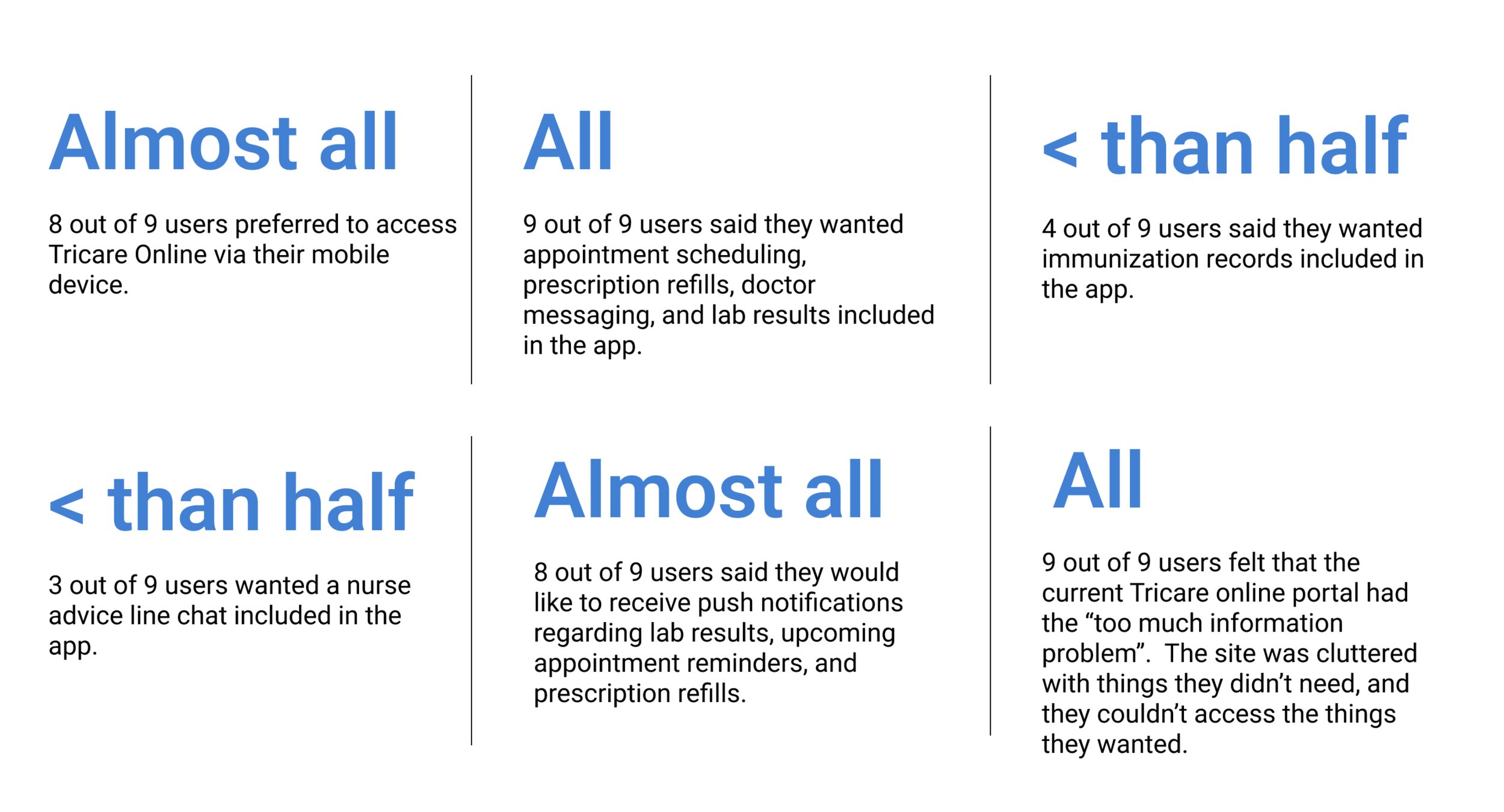
Gathering data: survey results
To start my research, I conducted a survey through Tally, and included 7 active duty servicemembers and 2 adult dependents (spouses). The goal of the survey was to see how they were currently interacting with the Tricare portal, what their pain points were, and if an app was created, what features they would like to see included. In addition to the stats below, users also expressed some of their top frustrations with the current portal was: logon difficulty, slow load times, and an inability to use it on their mobile device.
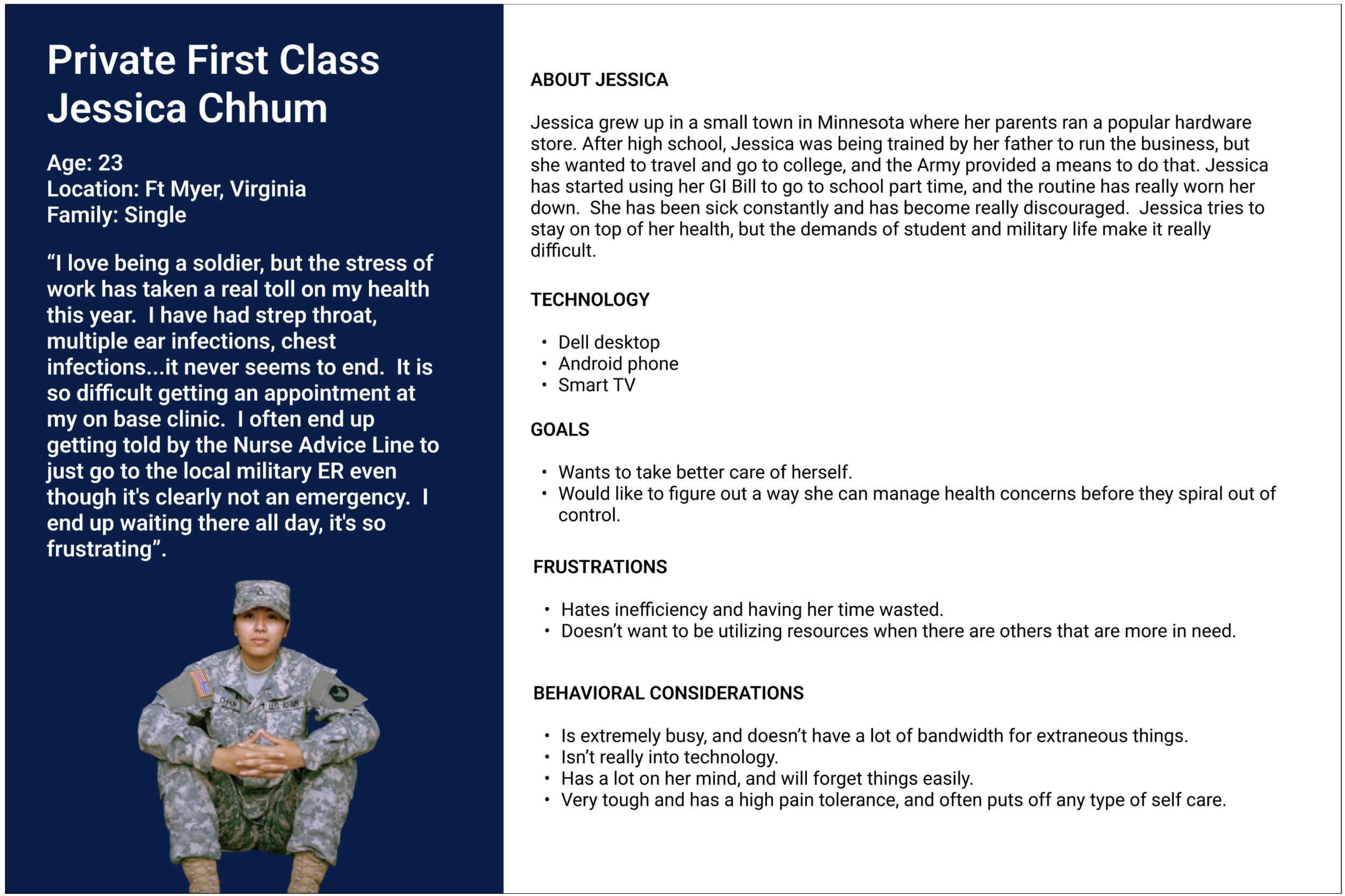
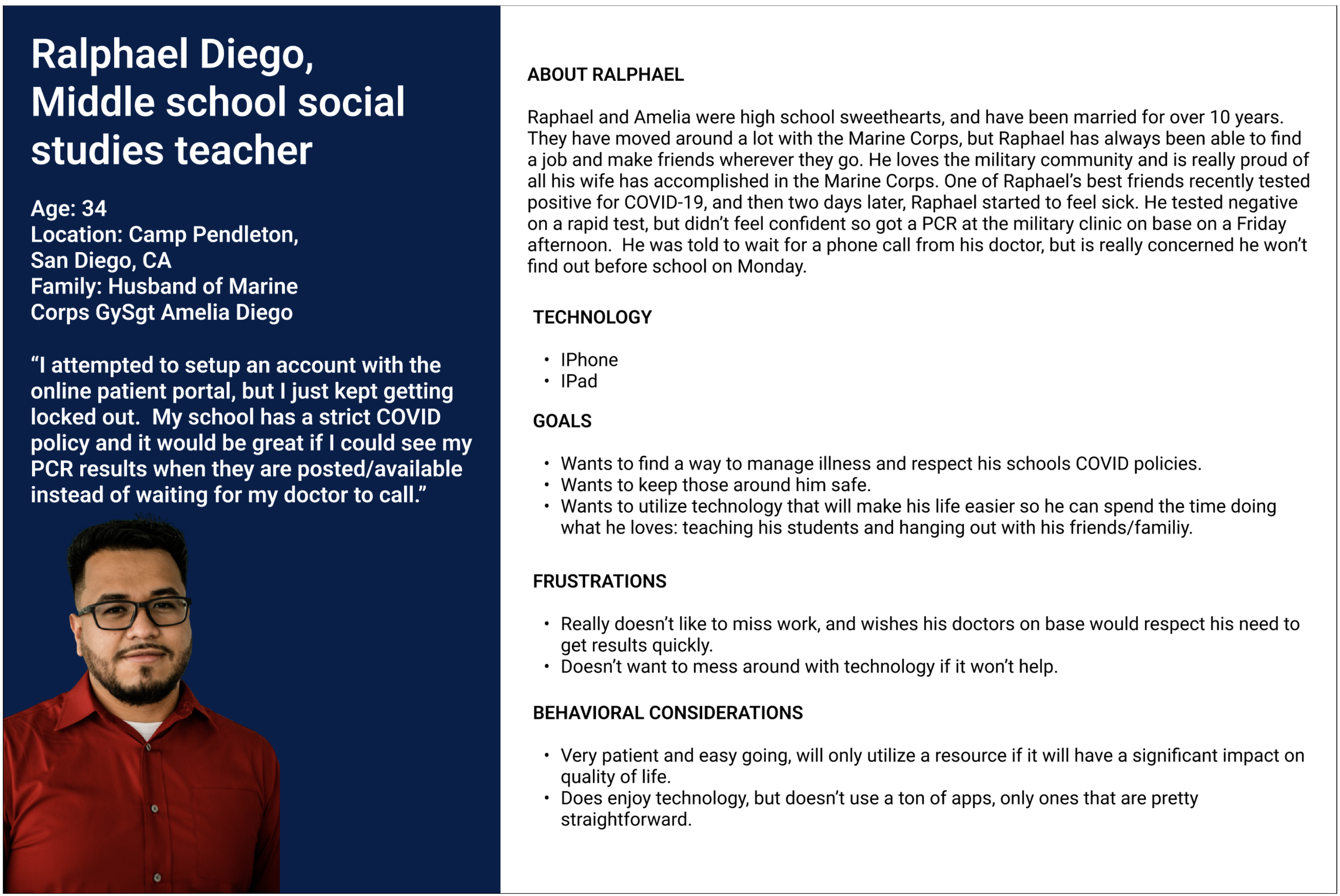
Meet the Users
Considering the audience for this project was fairly broad (all active duty service members and their families) I tried to represent as many people as possible through two personas. These were designed by referencing quantitative and qualitative data from my user interviews and survey.
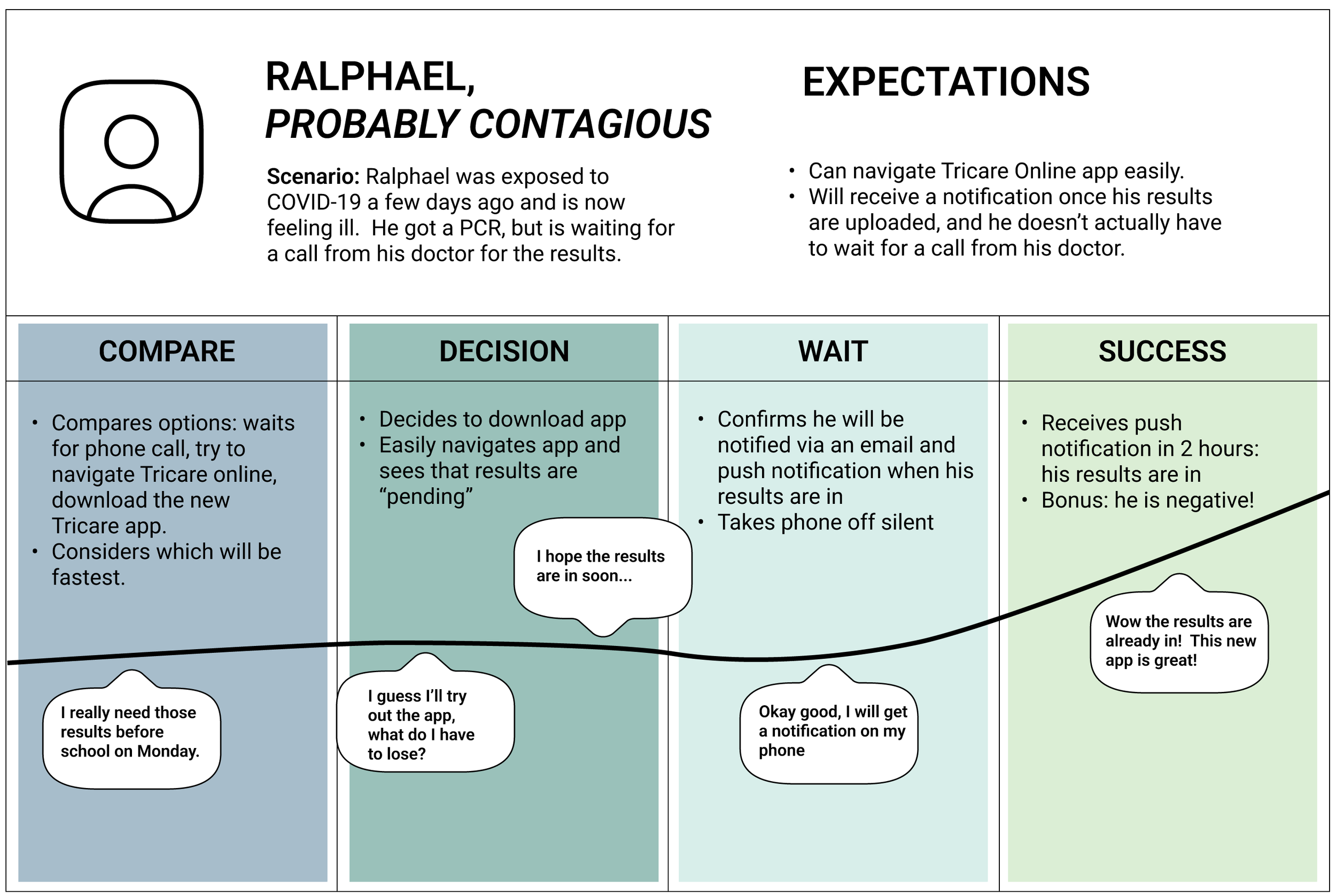
Journey Maps
To help me deepen empathy and better visualize the process of my users, I created two user journey maps.

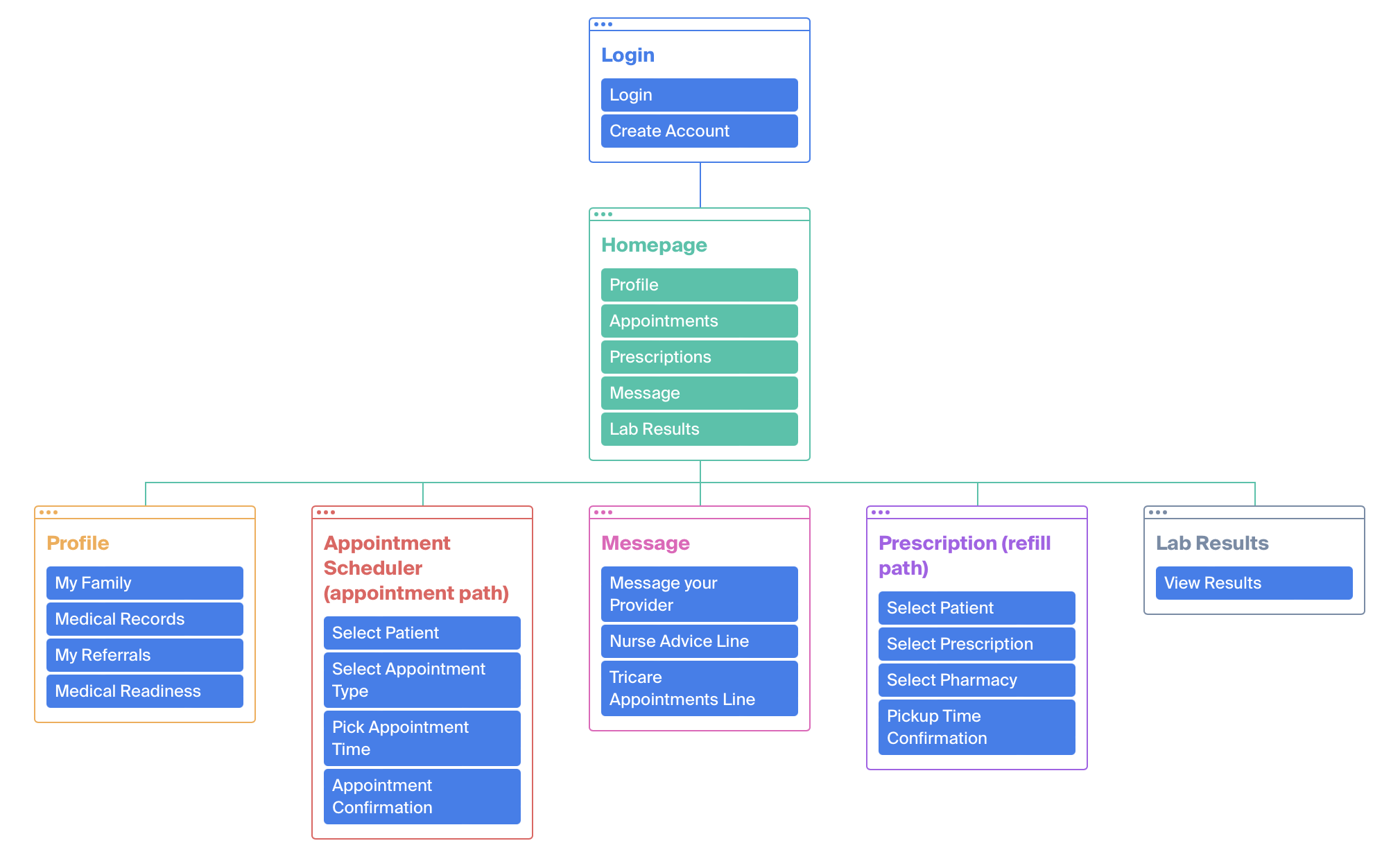
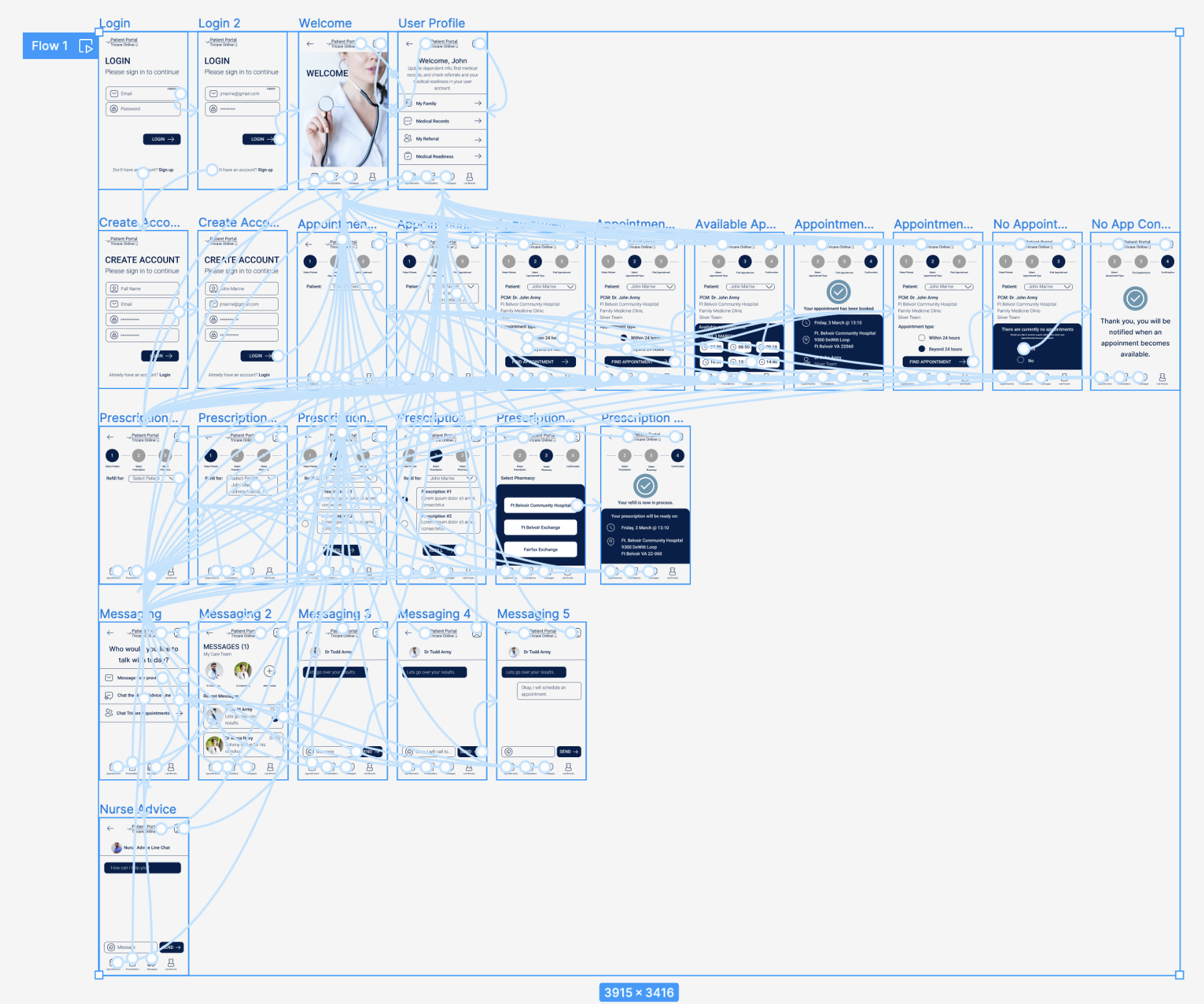
Site Map
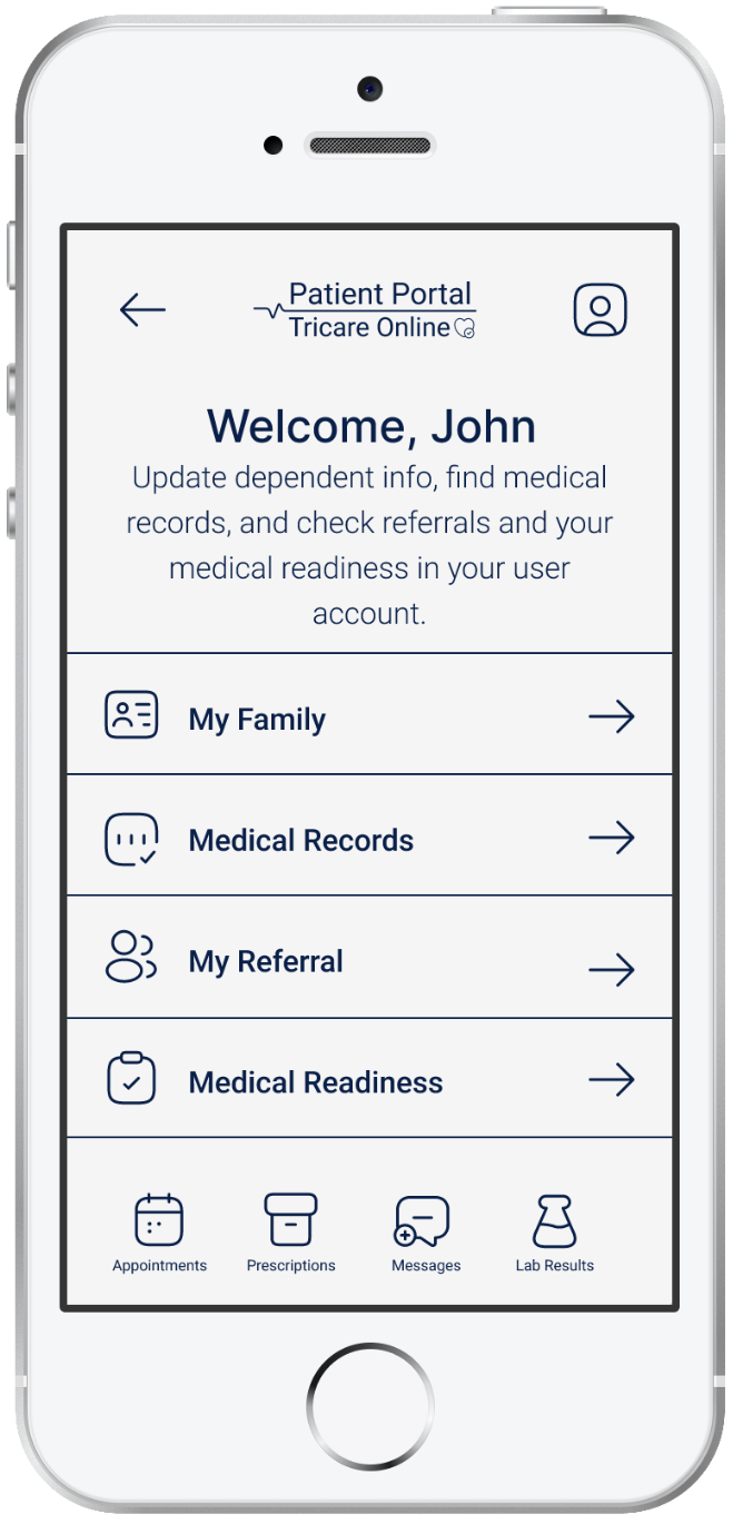
Considering the data I had gathered, it was clear from my research that users had 4 main objectives with the app: schedule appointments, refill prescriptions, message their care team, and get lab results. With this in mind, I started creating my site map.
Design
Ideation
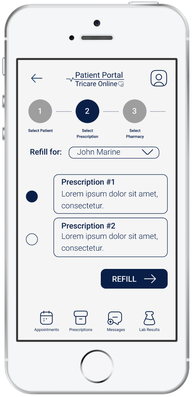
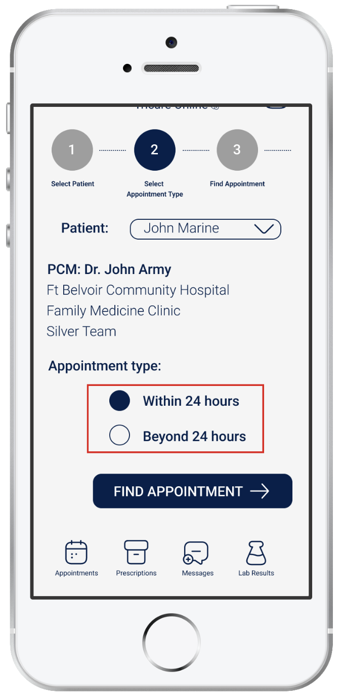
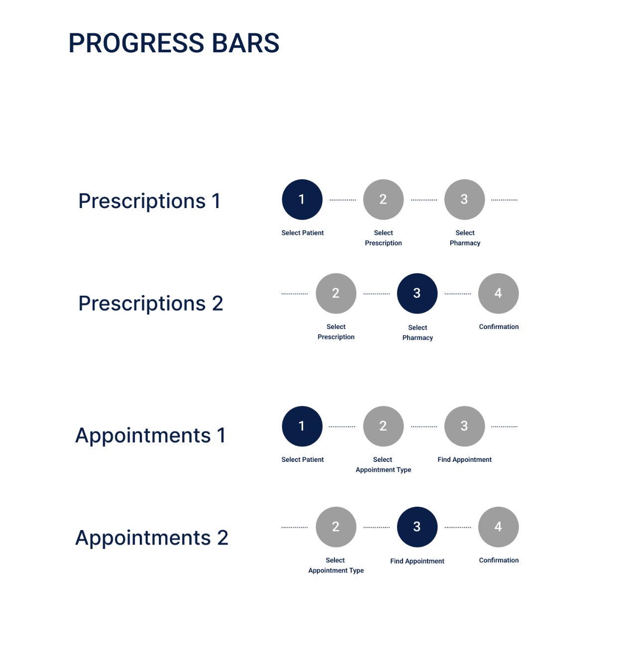
After my research phase, I then began exploring page layouts through sketching - determining what I thought best served users and made for a predictable design pattern. Through sketching I also decided to add a visual progress bar to the appointments and prescription refill flows.


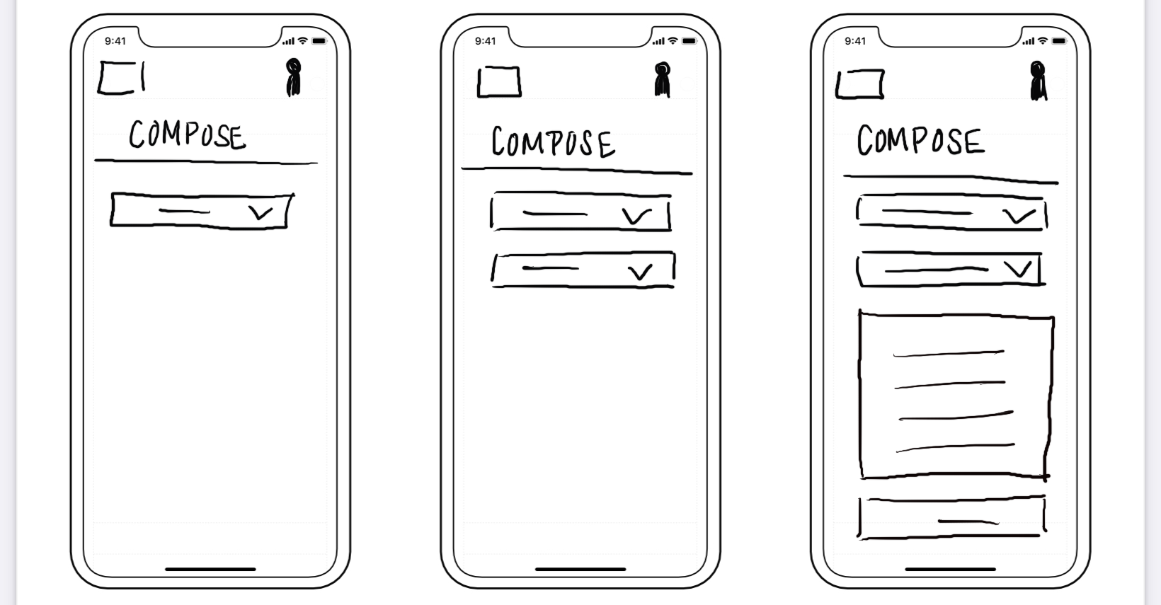

Low-Fidelity Prototype
After sketching out some screens, I decided on the basic layout and moved onto my low-fidelity designs. I used my low fidelity mockups to establish visual hierarchy, bringing attention to users most requested features.
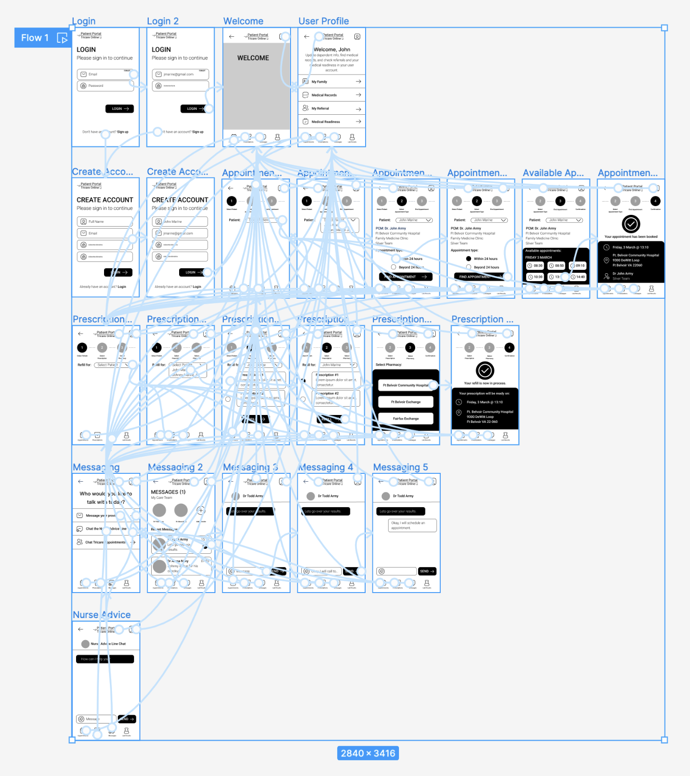
High-Fidelity Mockups


Usability Study: findings
After conducting a round of usability studies, it was brought to my attention that I had forgotten one big pain point among users:
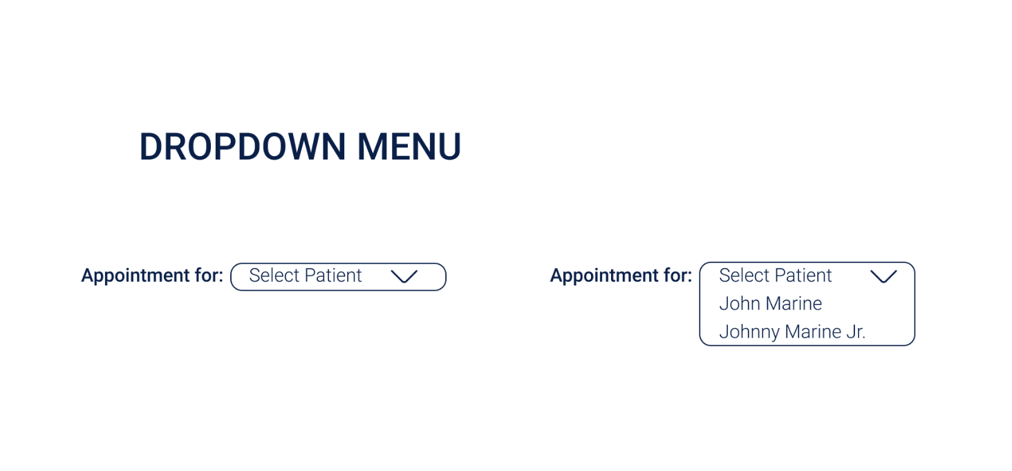
The no appointment problem: In the current system, acute care appointments (short 15 minute appointments occurring within a 24 hour time period) are released in batches every few hours. At times, these can be hard to come by, and users are forced to log back in frequently to check if more appointments have become available. To make this process as easy as possible, I decided to add a feature where users could opt to receive a push notification when new appointments were released.

In addition to the “no appointment problem” there were also accessibility concerns for users with limited dexterity who may have trouble hitting small targets. The small circles might be a challenge for these users, so in addition to making the circles clickable, I also allowed the text to be clickable as well, so the target would be larger, and subsequently easier to hit.

Refining the Design: Final High-Fidelity Prototype
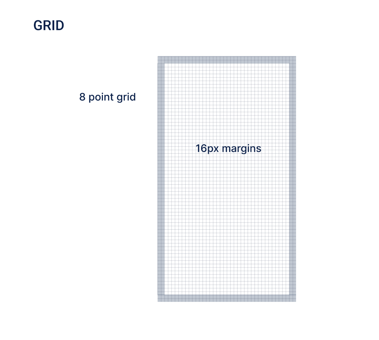
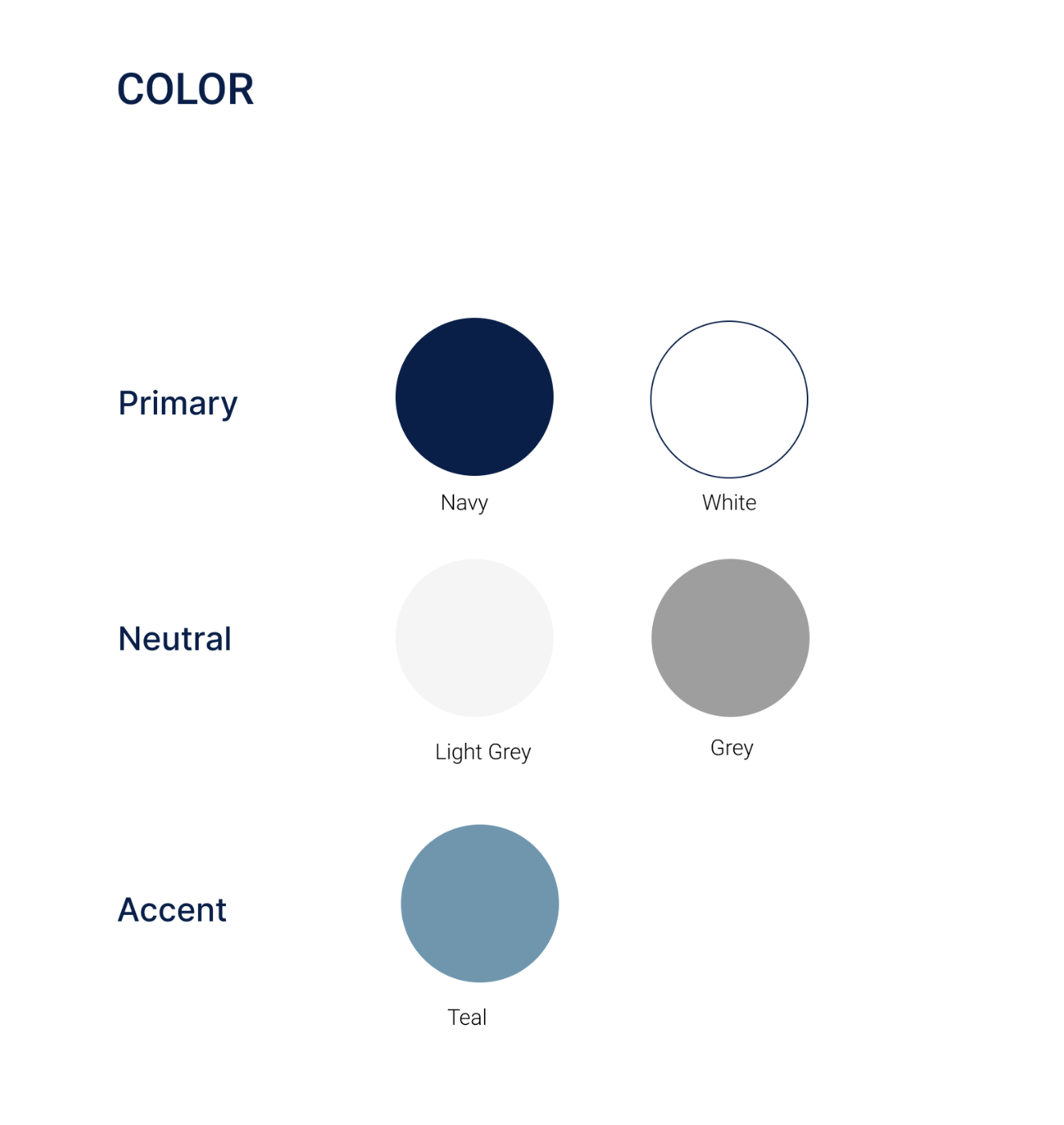
Visual Design
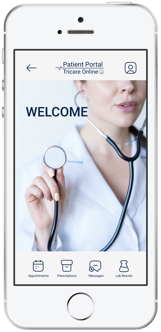
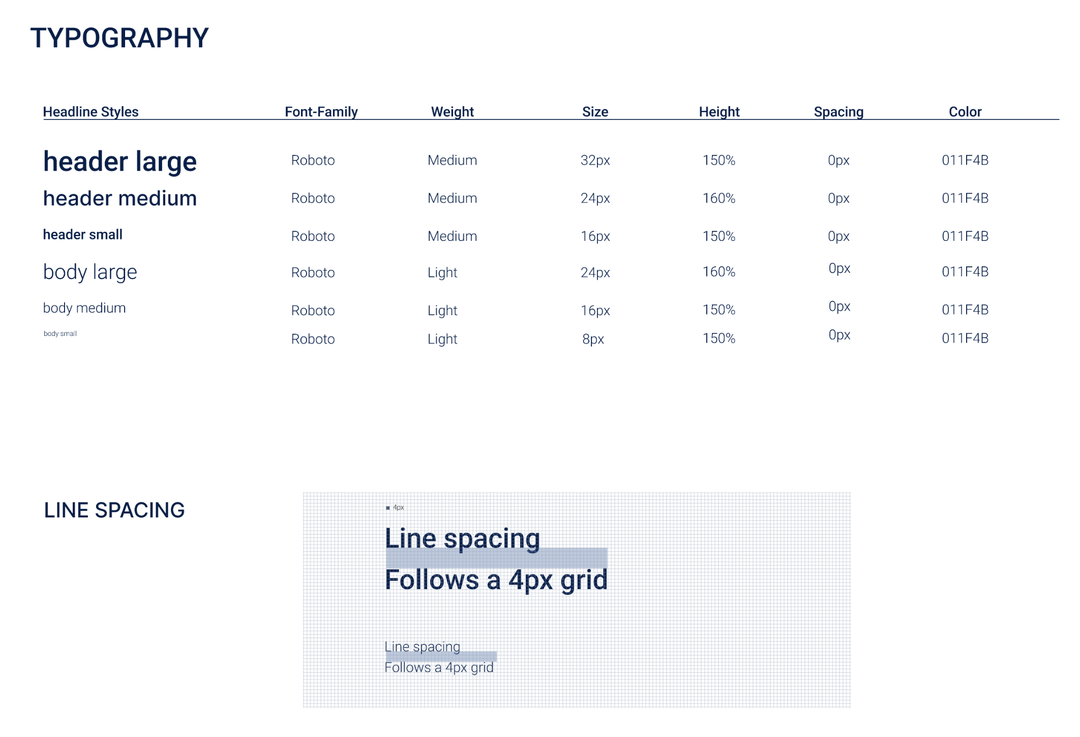
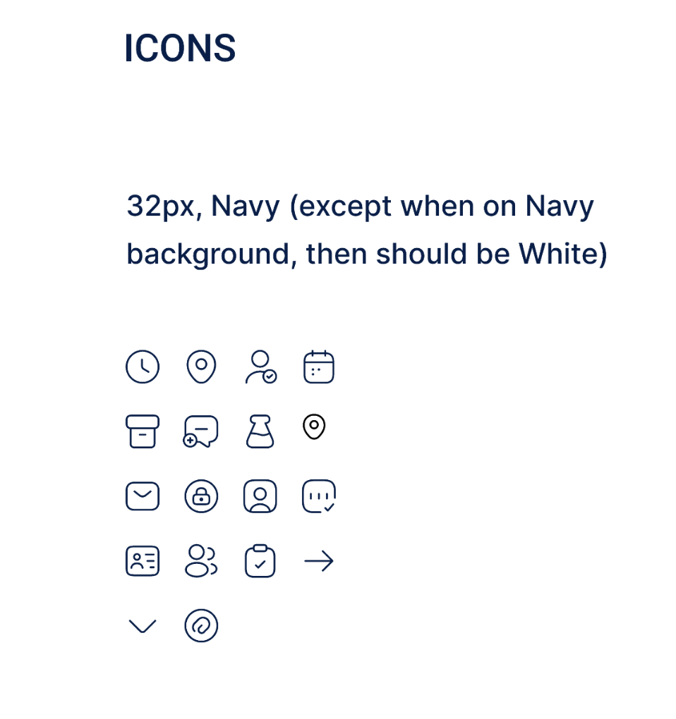
I wanted the visual design of the app to be simple and inclusive as possible, helping users easily achieve the main flows. I was careful to make sure text was large enough for users with limited vision to see without being distracting, and included a combination of icons paired with text. I also made sure that the colors met the WCAG contrast ratio accessibility standards. I went with a blue color scheme, considering most users associate blue with competency and trustworthiness.

Closing Thoughts…
Possible Contraints
If this was a project I was actually working on, as opposed to a conceptual design, there would most likely be several constraints that may impact the design of the app. Some possible limitations may be:
Healthcare is a highly regulated industry, and designs would have to adhere to regulations, privacy laws, data protection, and other specific industry standards.
There may be lengthy approval processes with multiple layers of stakeholders, legal teams, etc, that could slow down the design iteration process.
Limited flexibility and customization options due to regulatory requirements that may limit design options and ability to adapt to individual user needs.
Limited access to user feedback and testing.
Takeaways
Throughout this entire process, I was thinking a lot about how good UX design can really impact peoples lives in a positive way. If an app like this was implemented, and worked efficiently, servicemembers and their families would have better access to their healthcare, and in turn, would have better health outcomes.
Having been in the Marine Corps for 11 years, I was well acquainted with the pain points of this system, and it was very tempting for me to think I didn’t really need to do thorough research. After the survey, I was confronted with so many different perspectives and pain points. The research I did created a much better product then what I would have come up with on my own.