Fairfax County Park Authority
A redesign of the activity search experience
Conceptual Redesign Challenge | Desktop Experience | UX Research | UX Design | Figma | Photoshop | August 2025
The Problem: The Fairfax County Park Authority’s activity search page serves thousands of residents signing up for classes, camps, and community programs. However, the current search and filter experience is cluttered and unintuitive, making it hard for users to quickly find and register for activities. For working parents trying to secure camps or after-school programs, the confusing interface only adds to the stress and chaos of opening-day registration.
Solution: By streamlining filters, modernizing the search layout, and improving the clarity of results, the redesigned registration page makes it faster and easier for residents to discover and enroll in activities. A cleaner interface, clearer labels, and more intuitive navigation reduce frustration, transforming registration from a stressful process into a straightforward experience.
Fairfax County residents rely on the Park Authority site to register for camps and classes, but a cluttered and confusing interface makes finding and securing activities difficult.
Research

Heuristic evaluation of current interface
1. Search Flow & Usability
Match between system and the real world
Language clarity: Filter titles like “Category of Activity” and “Starting On or After” use system-oriented terms. Simplify to user-friendly, natural phrasing.
Redundancy: “Month” and “Starting On or After” overlap in meaning, creating confusion.
User control & freedom
Heavy cognitive load: Users are forced to begin with a blank search. They cannot browse or explore categories, which restricts their freedom to discover activities.
Too many filters up front: Presenting all filters at once may overwhelm users. Consider progressive disclosure (showing key filters first, with the option to expand).
Accessibility / Help users recognize, diagnose, and recover from errors
Accessibility: Dropdowns and search fields lack clear programmatic labels. This may cause issues for users with screen readers, motor disabilities, or cognitive limitations.
Aesthetic & minimalist design
The system announcement (“Our registration system was recently updated”) is irrelevant to the user’s goal and adds clutter. Remove or relocate.
2. Visual & Information Hierarchy
Aesthetic & minimalist design
Page layout: The filter form occupies the entire screen, pushing results below the fold. This buries core content and disrupts the visual hierarchy.
Consistency & standards
Header issues: Overloaded top-level menu, imbalanced branding, and visually heavy buttons. Buttons lack a clear primary vs. secondary distinction, reducing consistency with common design patterns.
3. Search Results Card
Match between system and the real world
Language clarity: Table titles can be simplified for clarity and scannability.
Aesthetic & minimalist design
Non-essential information: The “Session” column duplicates information and includes activity codes that are irrelevant to most users. This increases noise and reduces clarity.
Visibility of system status
Class status: Results lack visual cues and iconography to show availability (e.g., “Open,” “Full,” “Waitlist”). Without this feedback, users must scan text line by line.
Competitor analysis
Performed a competitor analysis comparing the Fairfax County Park Authority registration page to the YMCA, Reston Community Center, and DC Public Library. The review highlighted how competitors offer more intuitive browsing and streamlined filtering, setting higher expectations for users. These insights informed my redesign by showing where FCPA lags—particularly in search usability, visual hierarchy, and accessibility—and where opportunities exist to bring the experience closer to modern standards.

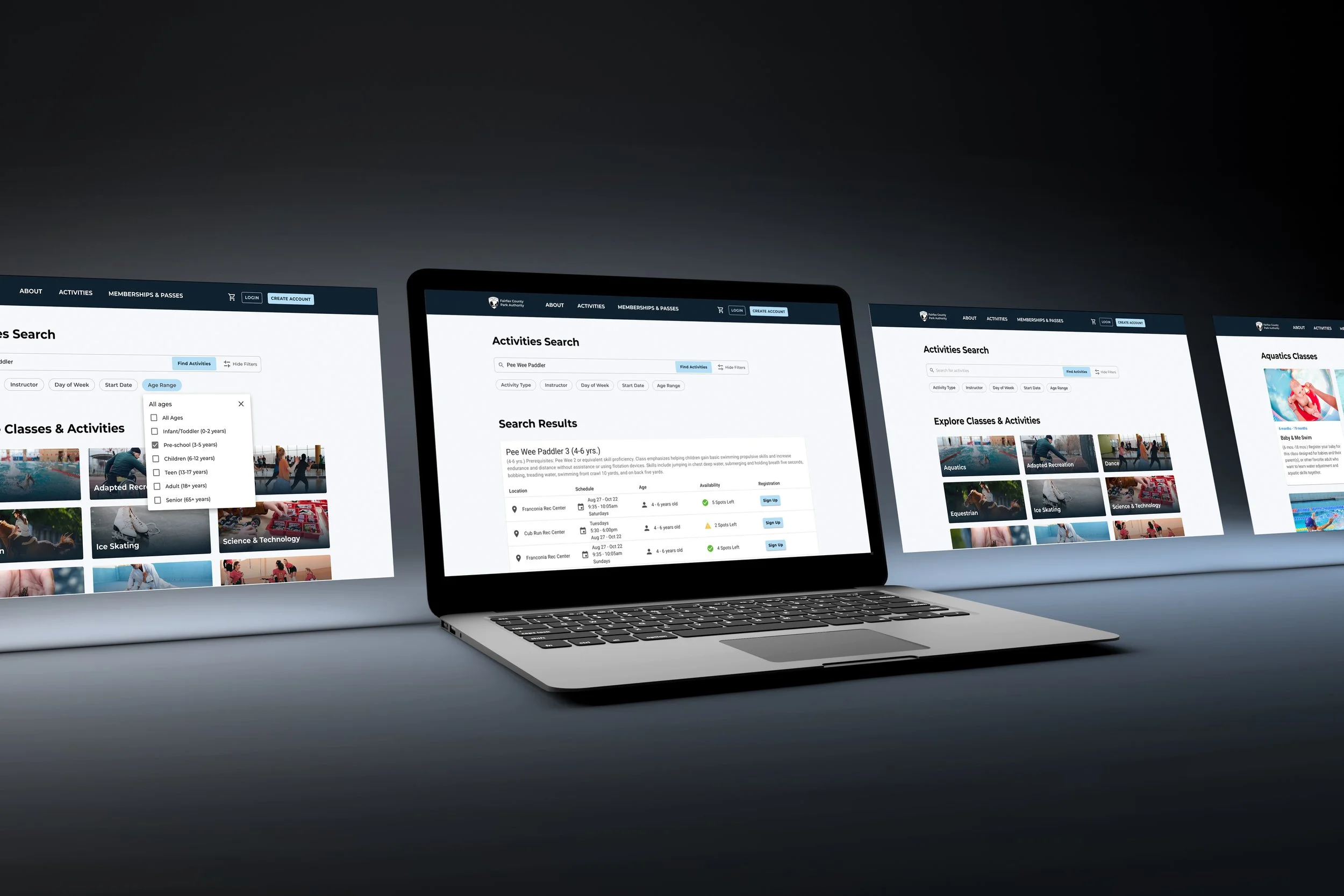
Final Designs
After a heuristic evaluation of the existing FCPA activity search page and a competitor analysis, I determined what primary design changes would improve the activity search experience.
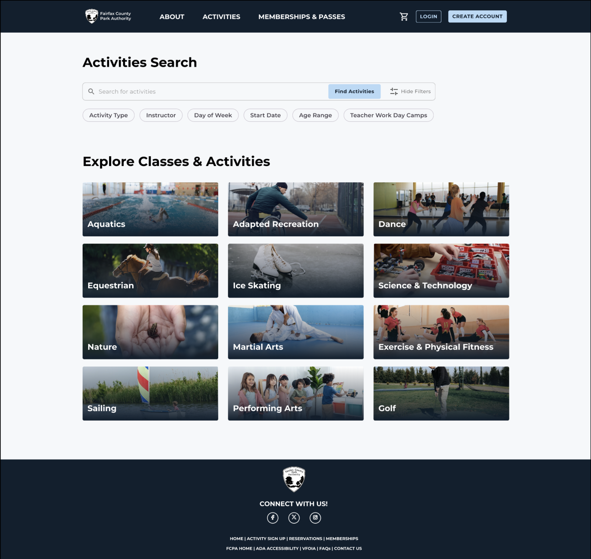
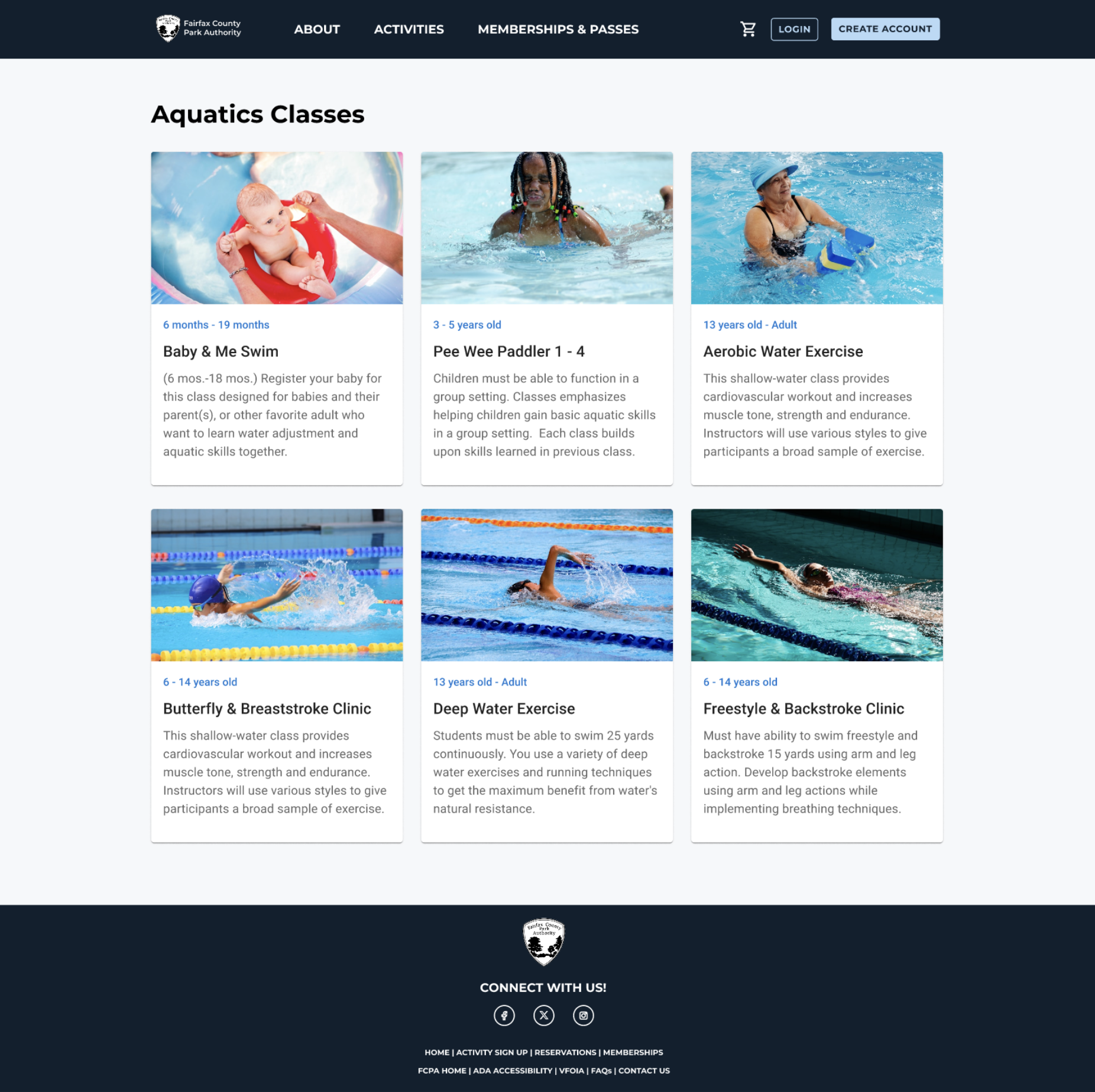
Improved browsing and discoverability by adding cards with imagery where users can browse activities at a glance. This both supports exploratory behavior and adds visual hierarchy so the page doesn’t feel like a blank form.
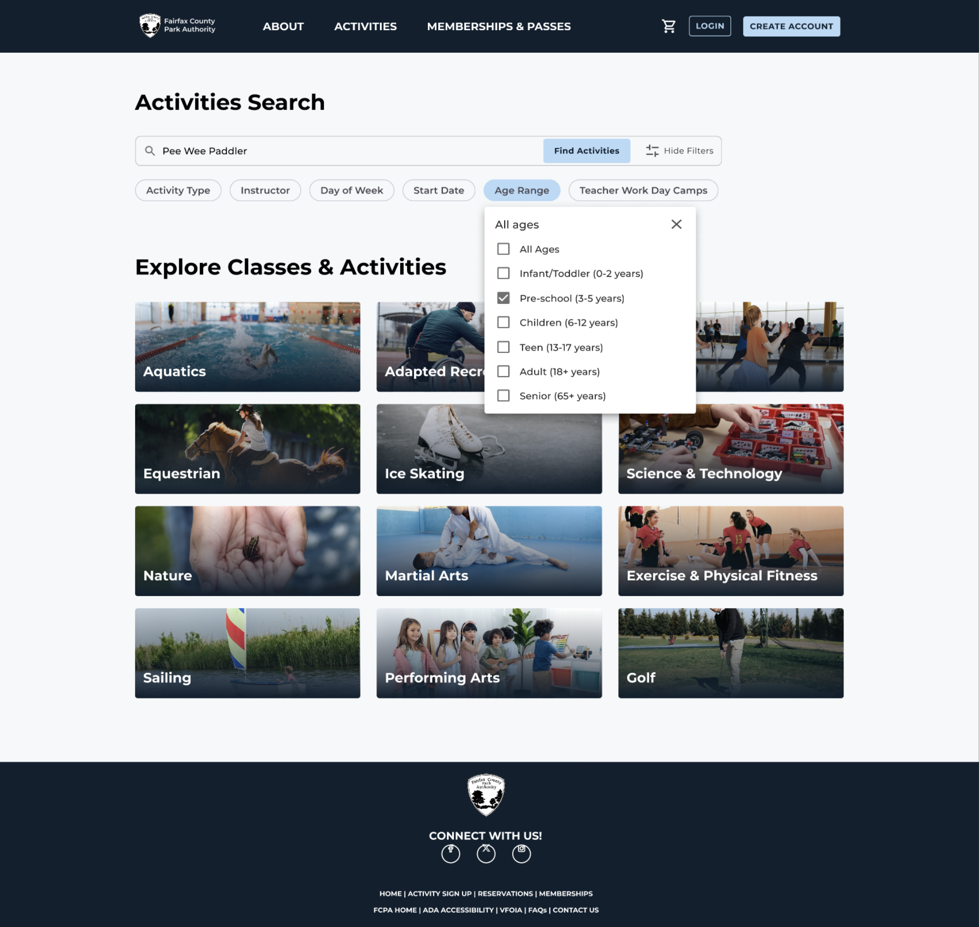
Streamlined search filters by updating to a prominent search bar and filters in easy-to-scan chips.
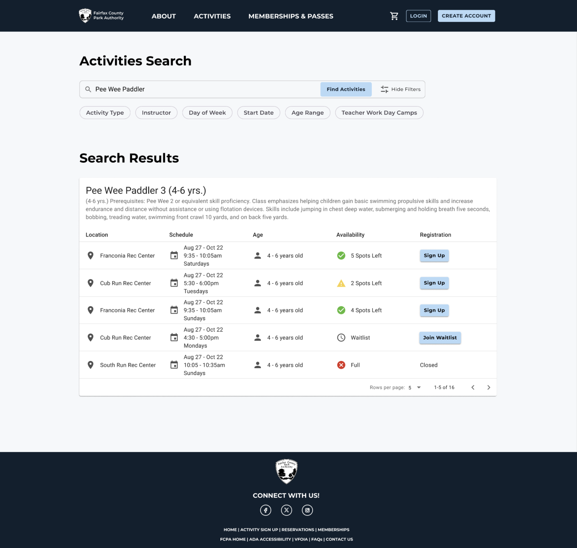
Improved language clarity by using more straight forward, simplified language in chip filters and search result table headers.
Removed redundancy in page announcements, filter text, and overlap.
Created a modern and accessible search results table. Introduced clear row headings, icons, and color coding for easy scanning. Also redesigned buttons to include primary and secondary for more visible call to actions.
Updated header with simplified navigation, primary/secondary buttons, and modern visual hierarchy.