
Conceptual Design | Mobile App | UX Research | Visual Design | Figma | Photoshop | Jan 2023
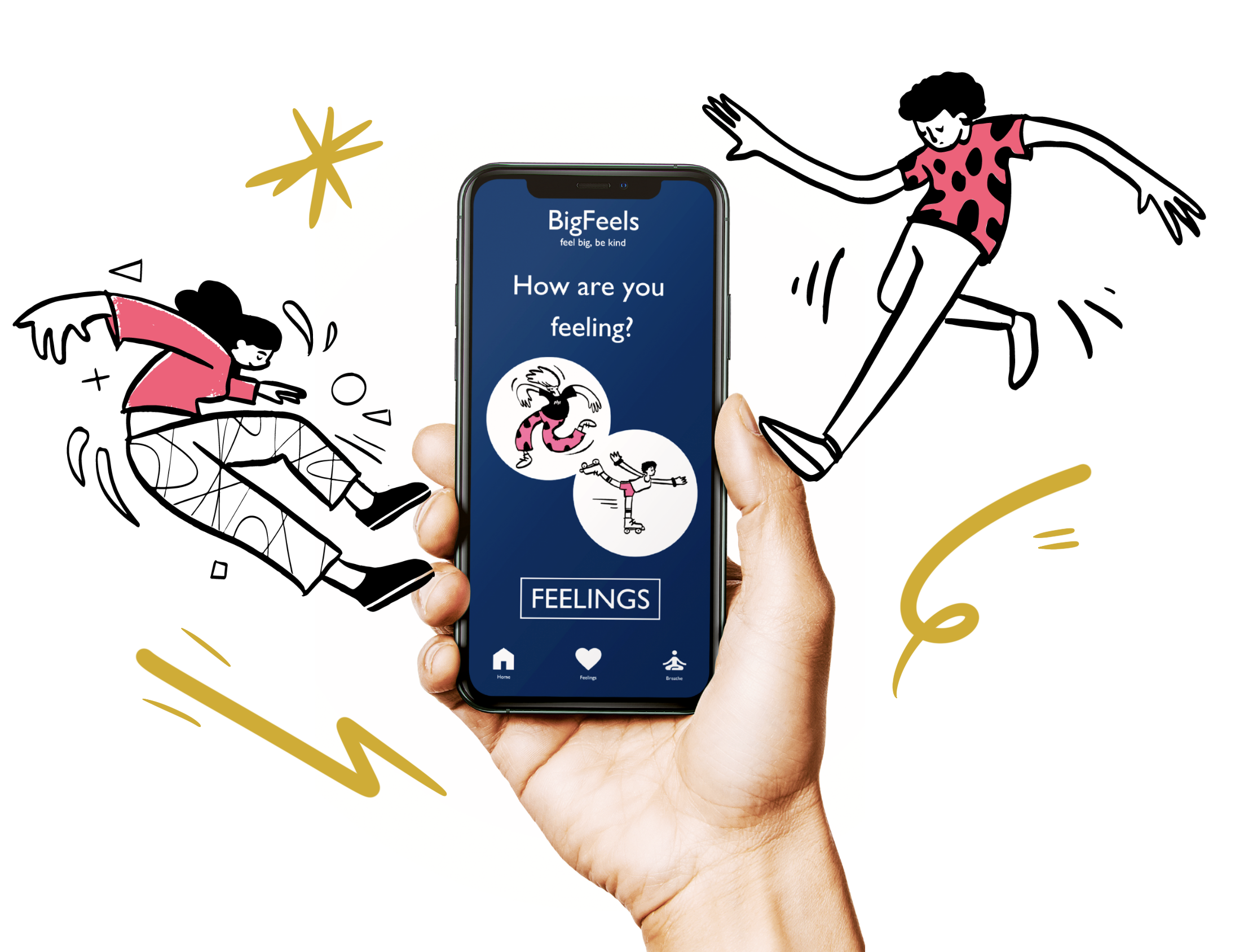
Feel big, be kind
The problem: Every day children struggle with what they are feeling, how they should deal with those feelings, and how to identify those feelings in others. Caregivers also struggle to find tools to help them.
The solution: BigFeels is a mobile app focused on helping children with social-emotional learning, development, and empathy. BigFeels primary target users include children between the ages of 2-12 and their caregivers.
Children and their caregivers need a tool to help with social-emotional learning and the development of empathy.
Research
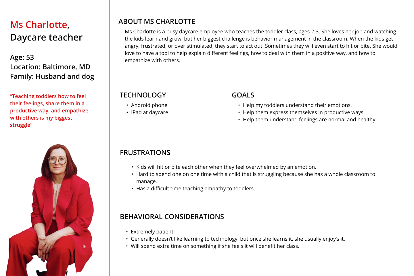
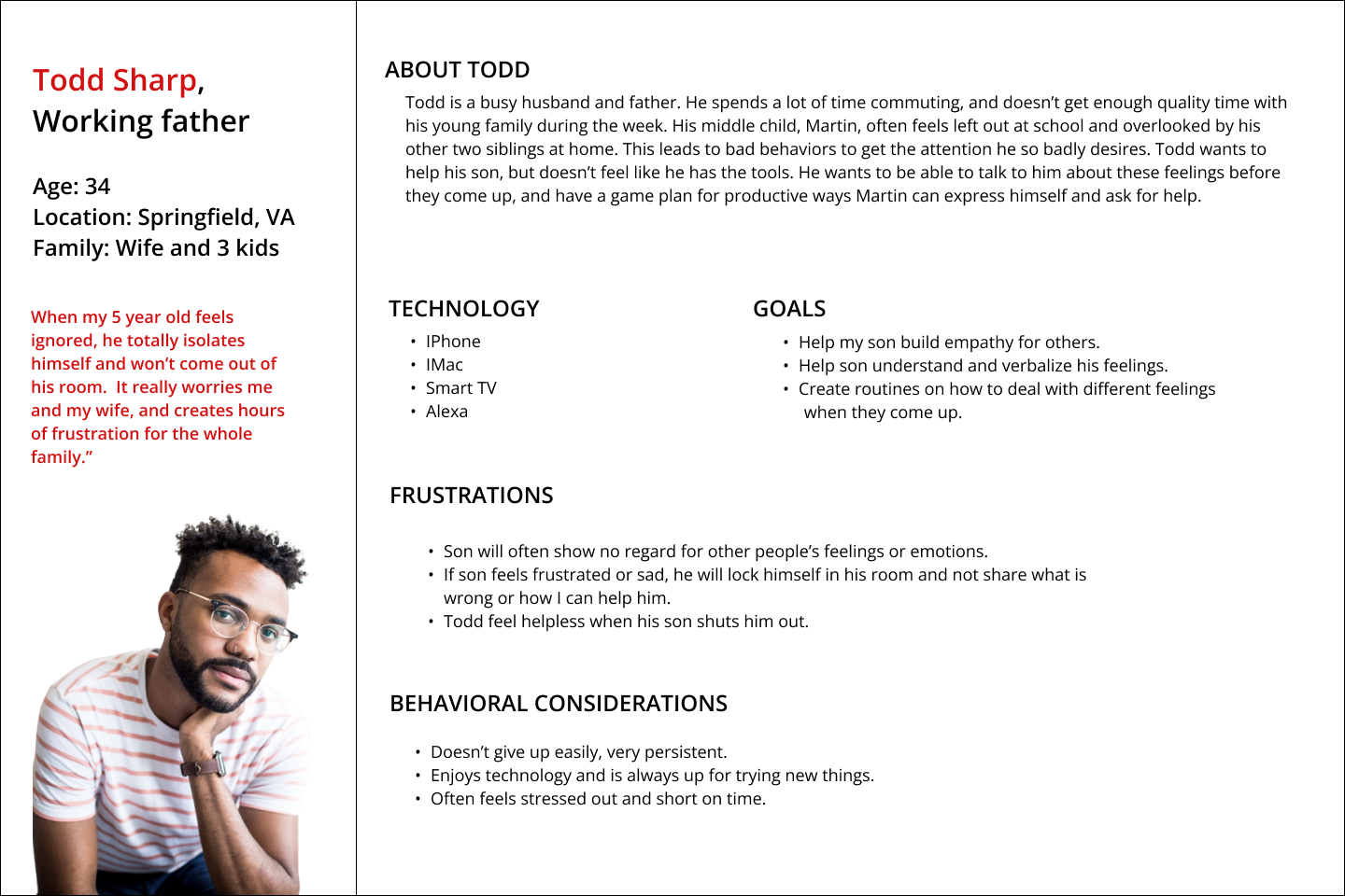
Meet the Users
Competitive Audit
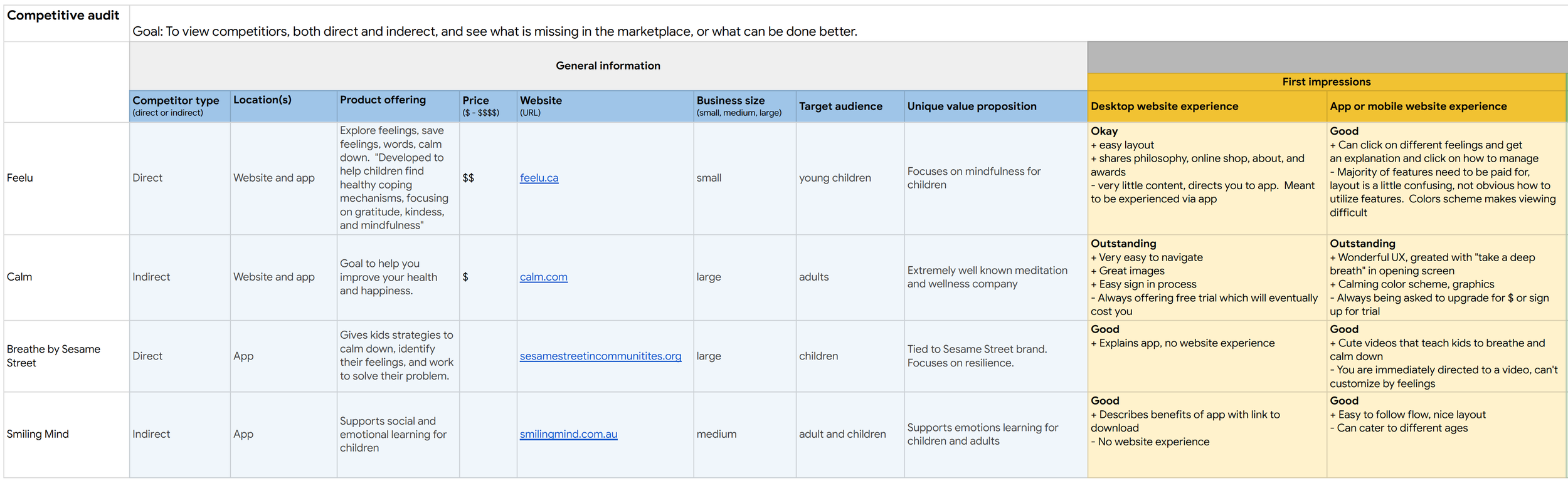
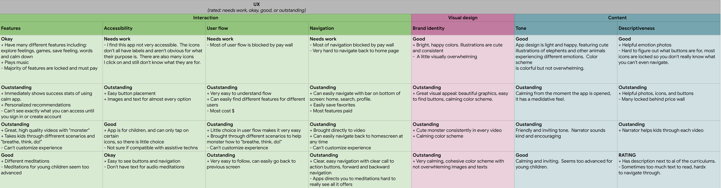
After conducting a competitive audit, I determined there were the following gaps in the market:
A tool that allowed user to search through every feeling offered by the app without a fee.
Utilizing a more diverse set of music to combine with each feeling (current apps only use public domain classical music).
A tool utilizing a more simplistic flow that would be easy for children to use without a caregiver.
Design
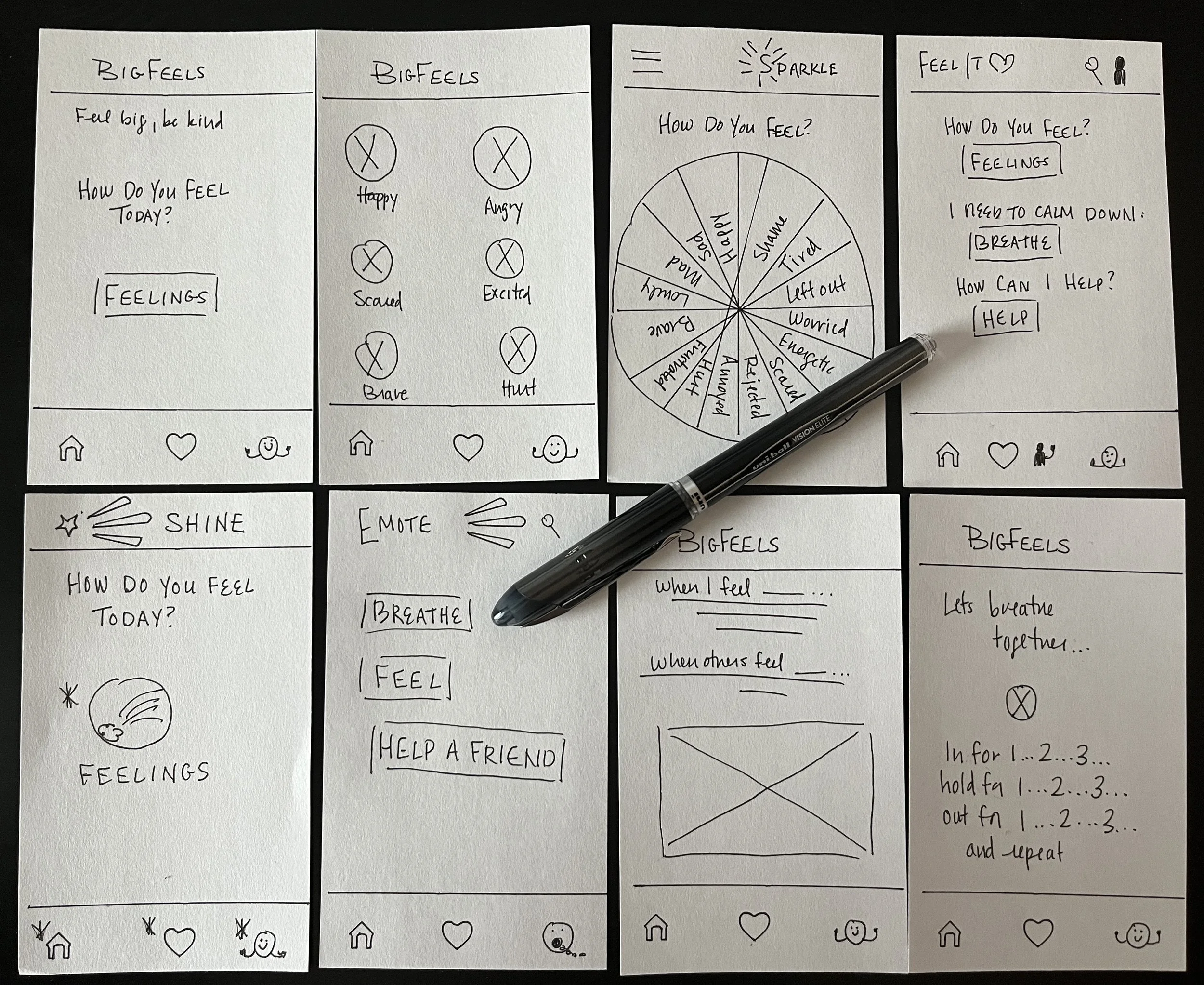
Ideation
I then entered into the ideation phase keeping in mind everything I had gathered so far - personas, their pain points, and what direct and indirect competitors were offering. I started to sketch some mockups, brainstorming on different layouts, titles, and designs for the app. I then decided what to keep and moved into my low-fidelity prototype.
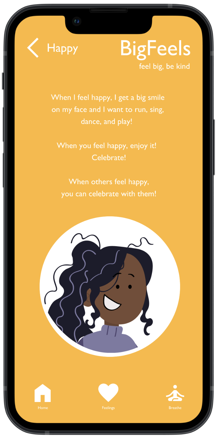
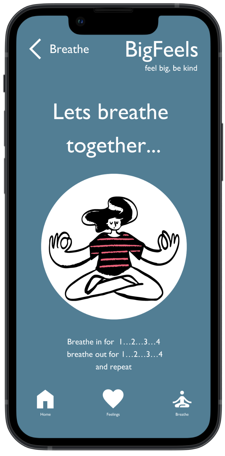
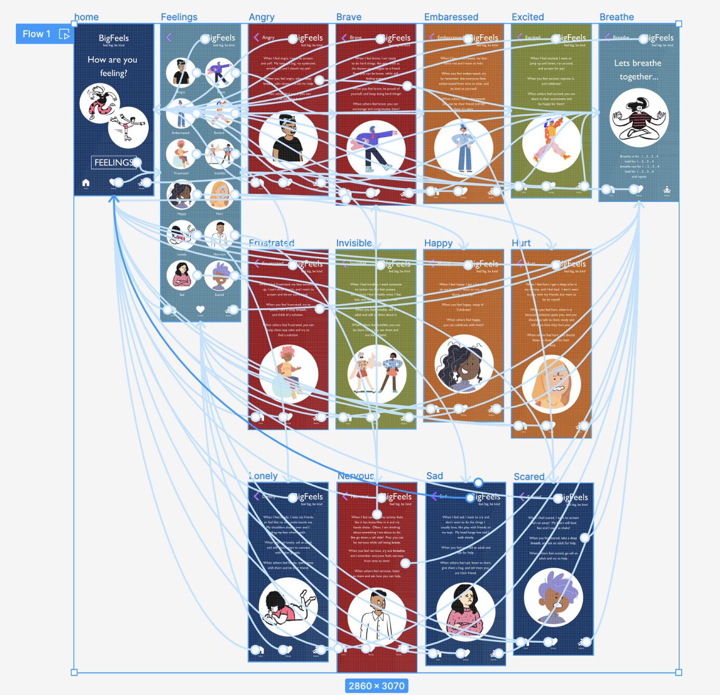
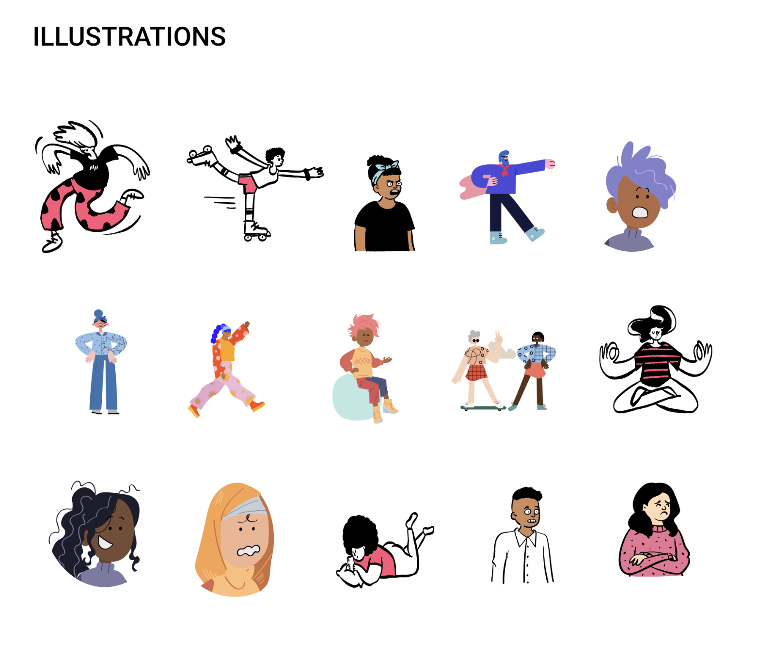
High-fidelity mockups
After creating my low-fidelity prototype - where I focused on creating a consistent, easy, and repetitive user flow - I then moved onto my high-fidelity designs.


Usability Study: findings
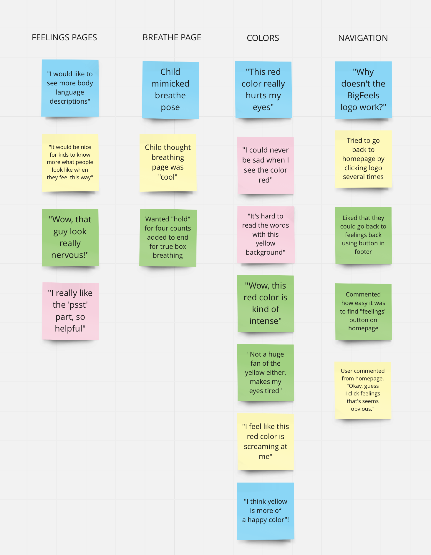
After conducting a usability study, I gathered all of my findings and compiled them into an affinity diagram. Through this process I discovered six insights about the design and user flow:
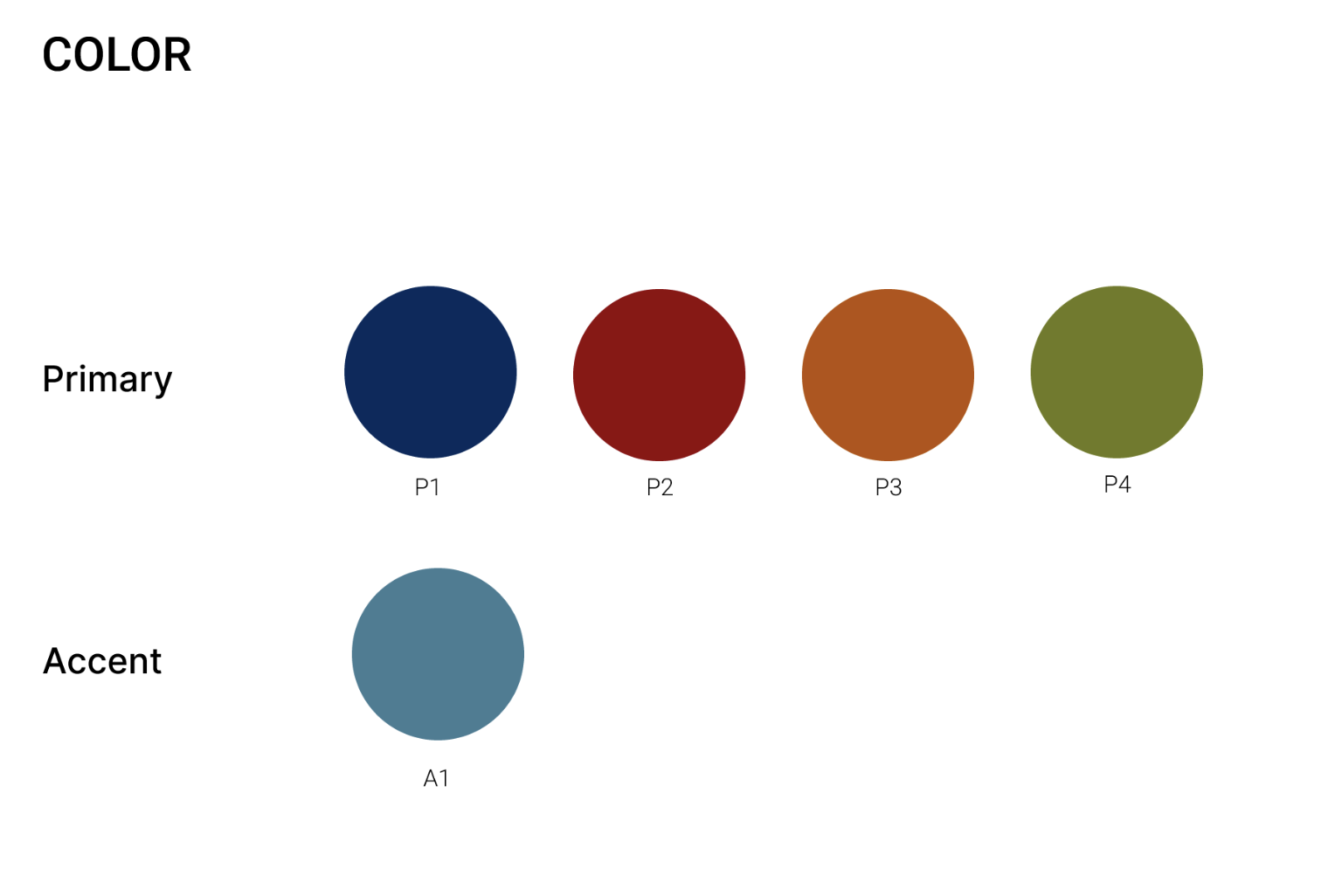
The yellow and red in the color palette hurt several users eyes. I chose new, more muted colors. I also updated the green, yellow, red, and teal colors to meet the WCAG contrast ratio accessibility standards.
Users associated certain colors with certain emotions, and the current app design contradicted their associations.
Users wanted more body language descriptions associated with each feeling.
Users wanted to access the home page by clicking on the “BigFeels” logo in the upper right corner.
Users wanted to access the “breathe”, “scared”, and “nervous” pages when they were referenced by clicking on the word.
Was instructed to change the “breathe” exercise to add a “hold for 4" counts” at the end before repeating, but that is true box breathing.
Refining the design
Based on my findings from the usability study, I made several changes to my high-fidelity mockups:
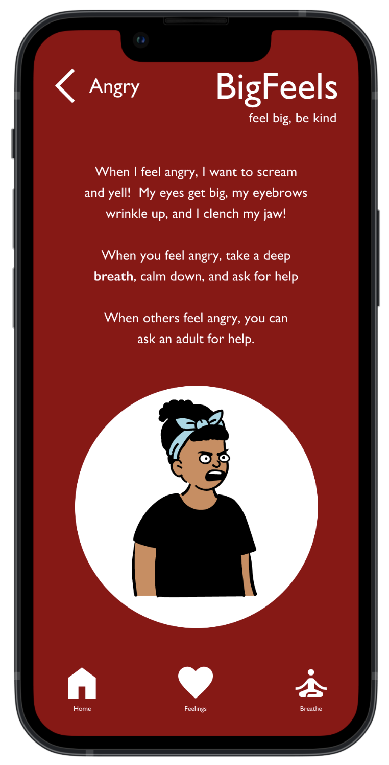
Switched to more muted red color
Linked to “breathe” (and “scared”) pages.

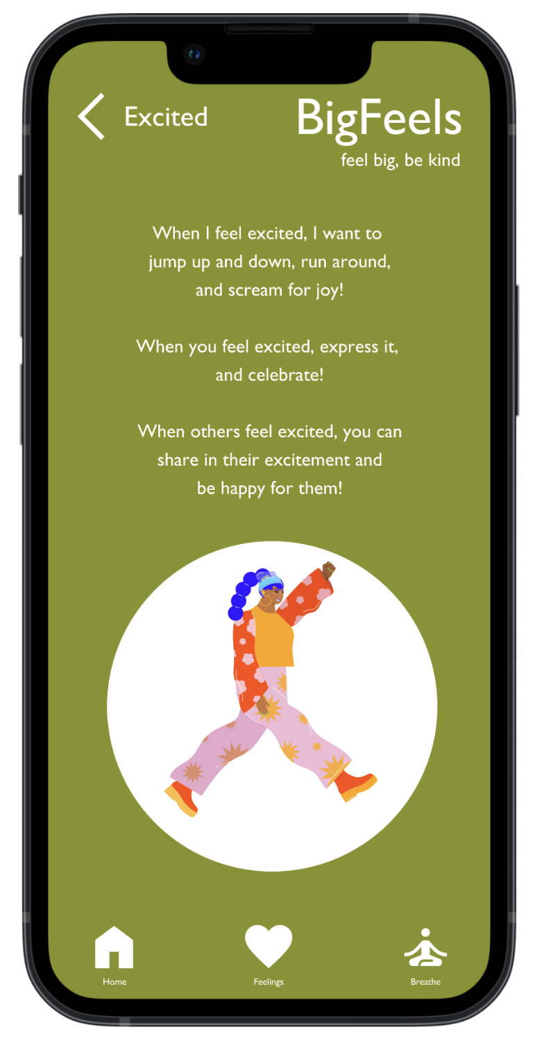
Changed colors of feelings pages to better align each feeling with associated color.
Added more body language references.
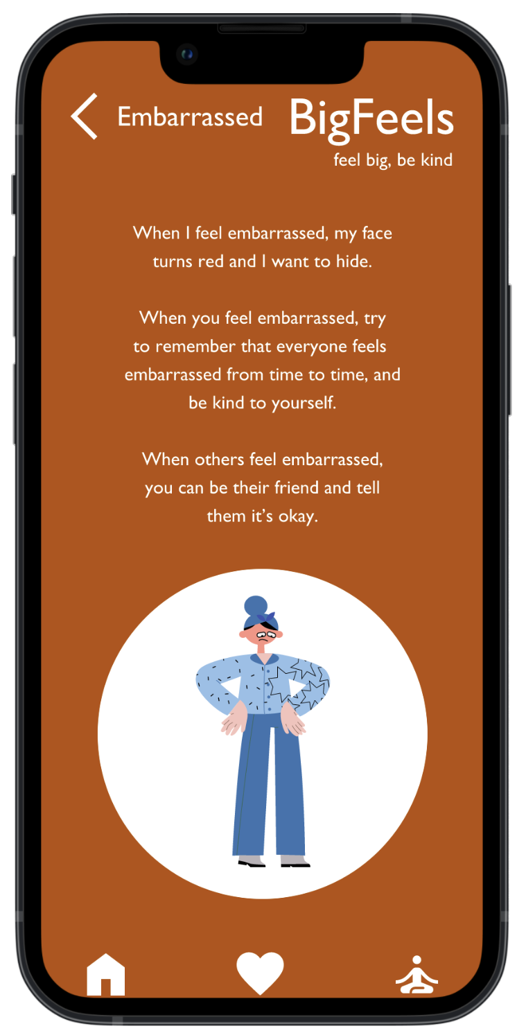
Switched to more muted orange color.
Linked BigFeels logo to homepage.
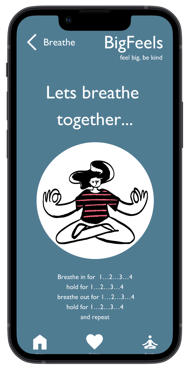
Added 4 count hold at end of breathing exercise to better align with true “box breathing”.
High-fidelity prototype
Visual Design


Next Steps
I’m so excited for the future possibilities of the BigFeels app. I would like to explore the following:
Conduct research on how successful the app is in reaching the goal of learning about feelings and developing empathy in children.
Add audio to each feelings page so children who can’t read can participate without the help of a caretaker.
Add music to teach feeling, hopefully increasing the impact of understanding the different emotions. Through my research I noticed that competitors all utilize classical music, and would like to explore using different genres.