HealthNow
Advancing health equity for Virginians
Conceptual Design | Mobile App | UX Research | Visual Design | Figma | Adobe Photoshop | Jan 2023
The problem: Uninsured and low income populations in Virginia need access to quality healthcare. While telemedicine apps have become popular in recent years, these apps fall short of providing long term care for chronic illnesses, management of behavioral health, and dental/vision care.
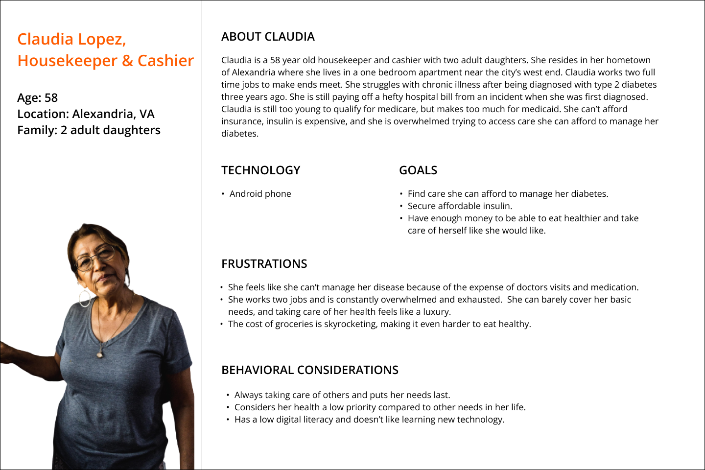
The goal: HealthNow app exists to advance health equity in Virginia by helping users find comprehensive, affordable healthcare. HealthNow will do the often overwhelming work of researching providers and compiling necessary information for users, so they can access the critical information. The targeted users for the HealthNow app are uninsured, underinsured, and low income Virginians between the ages of 18-65.
Uninsured, underinsured, and low income populations in Virginia need a tool to help find comprehensive and affordable healthcare.
Research
Quantitative Data
The first thing I did when thinking through how to design HealthNow was gather secondary data from the Virginia Health Care Foundation and the Pew Research Center. These findings were particularly helpful in deciding to design a mobile app instead of a responsive website, since the majority of users did not have home broadband, and their smartphone was their main access to the internet.
76% of households making under $30k a year own a smartphone, but only 57% have home broadband.
6.5% of Virginians living under the age of 65 are without health insurance.
Majority of uninsured Virginians are families living with incomes at or below 250% of the federal poverty level, and do NOT quality for Medicaid.
4/5 uninsured Virginians come from working families.
Meet the Users

User Stories
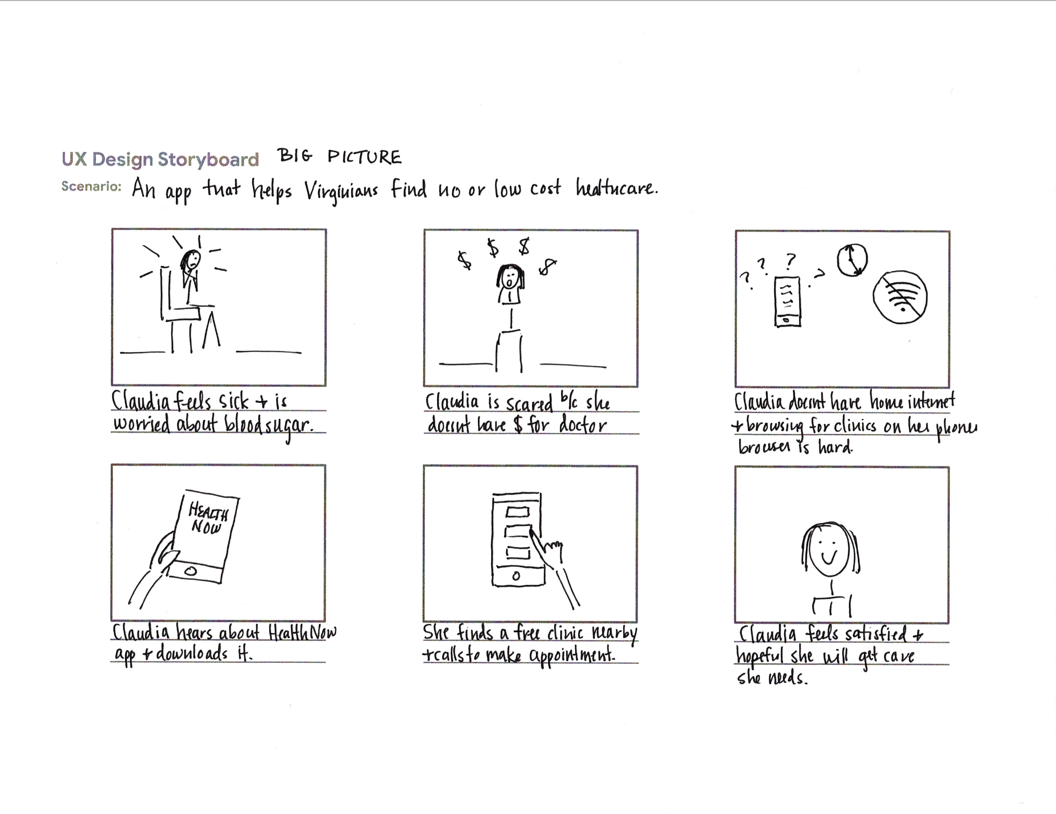
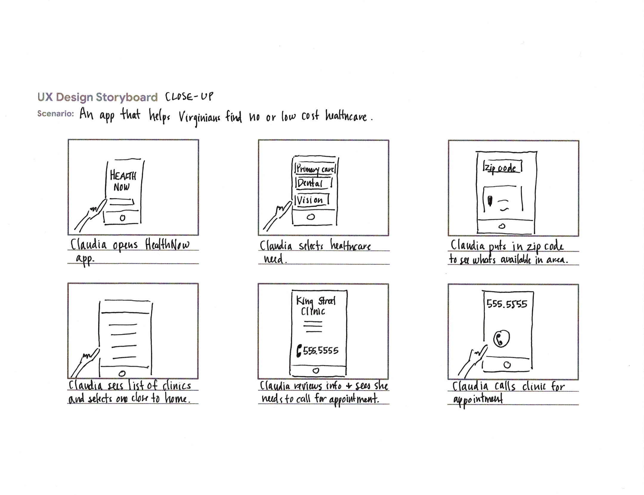
Storyboards
User Flow
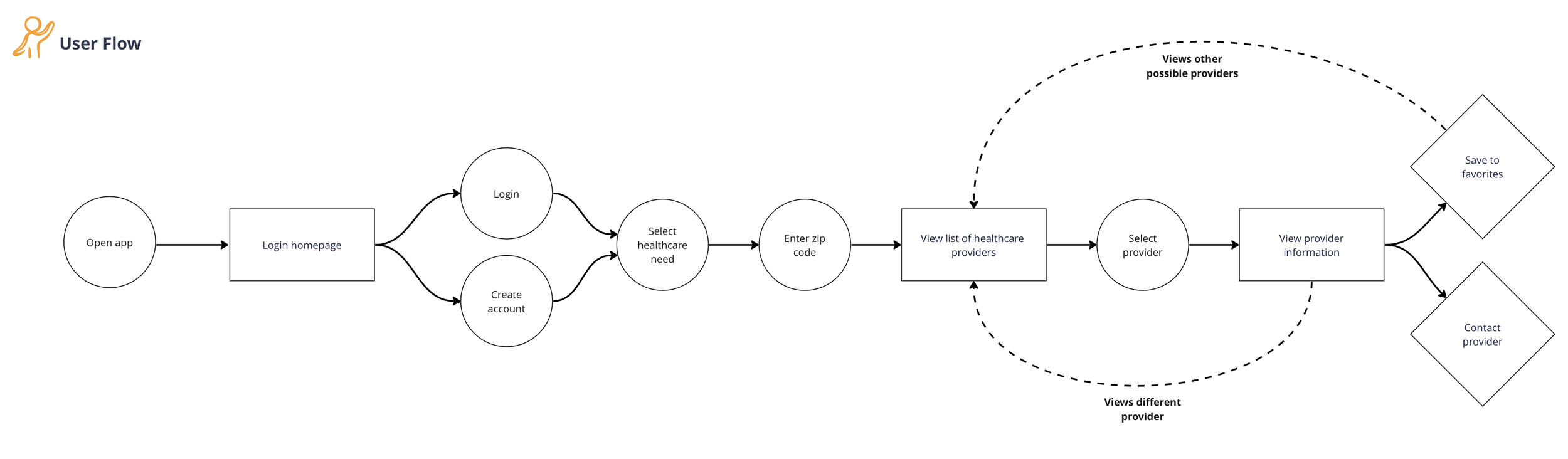
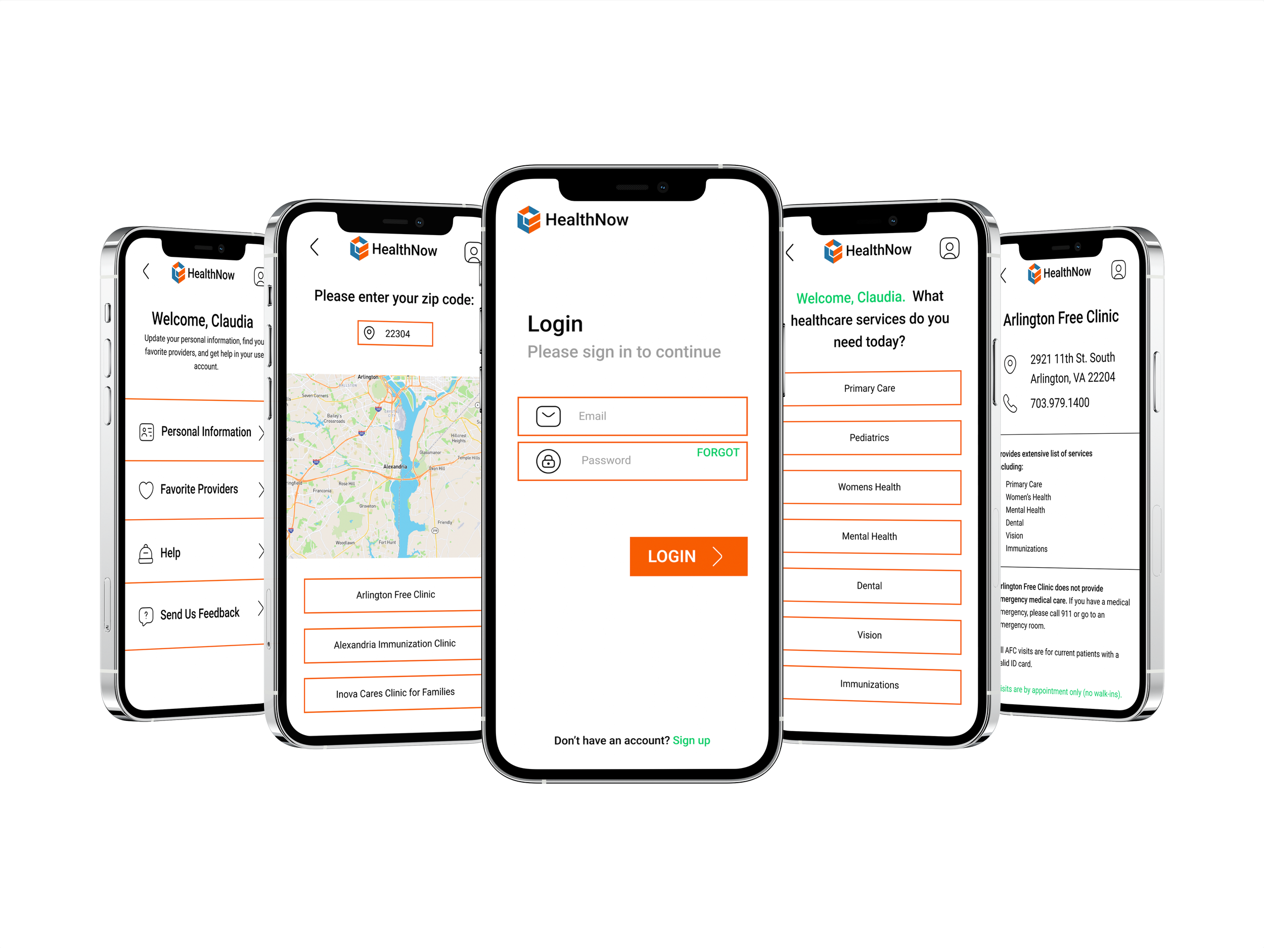
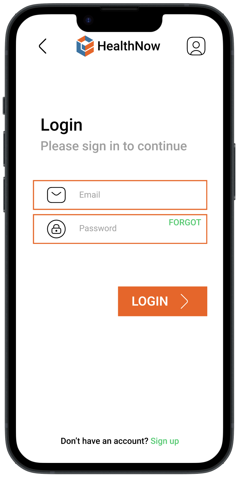
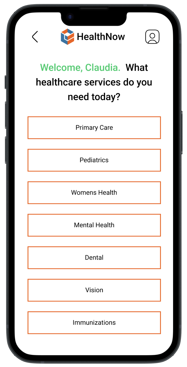
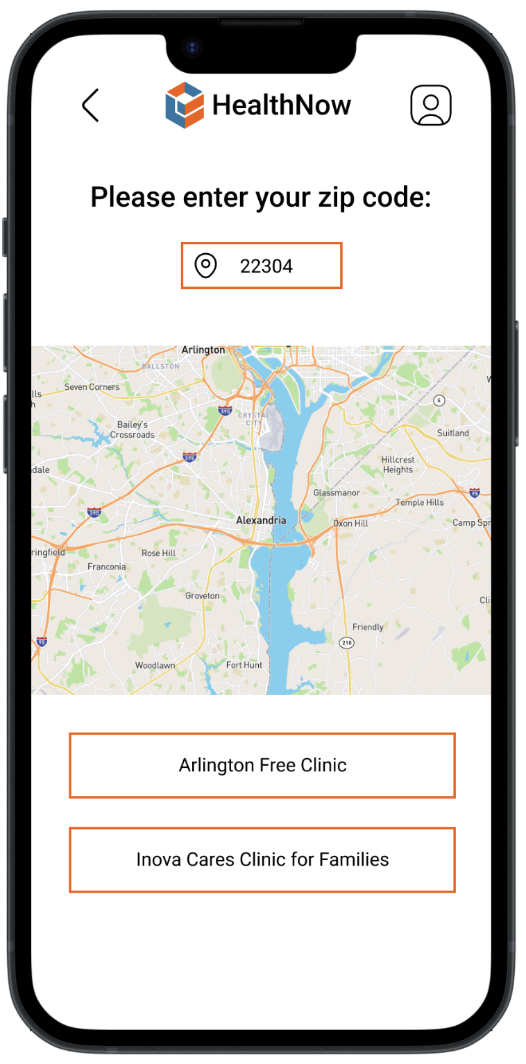
The proposed user flow: I decided on a user flow that began with a login directly on the homepage. After the user signs in or creates an account, they are immediately directed to the new homepage, where they are given a list of healthcare needs (primary care, women’s health, mental health, etc) that they can choose from. They are then directed to page that has them enter their zip code, and local providers are shown both on a map and in list form. When selected, each provider has its own page, where pertinent information such as contact info, fee scale, walk-in/appointment hours, new patient info, transportation options, and required documentation is provided.
Design
Low-fidelity Prototype
Keeping in mind my users and their needs, I then sketched out some screen layouts and moved into my low-fidelity prototype.

High-fidelity mockups
After creating my low-fidelity prototype, I then moved onto my high-fidelity design, where I focused on visual consistency and accessibility.

After the prototype was finished, HealthNow went through a series of usability studies. Three user pain points came up several times:
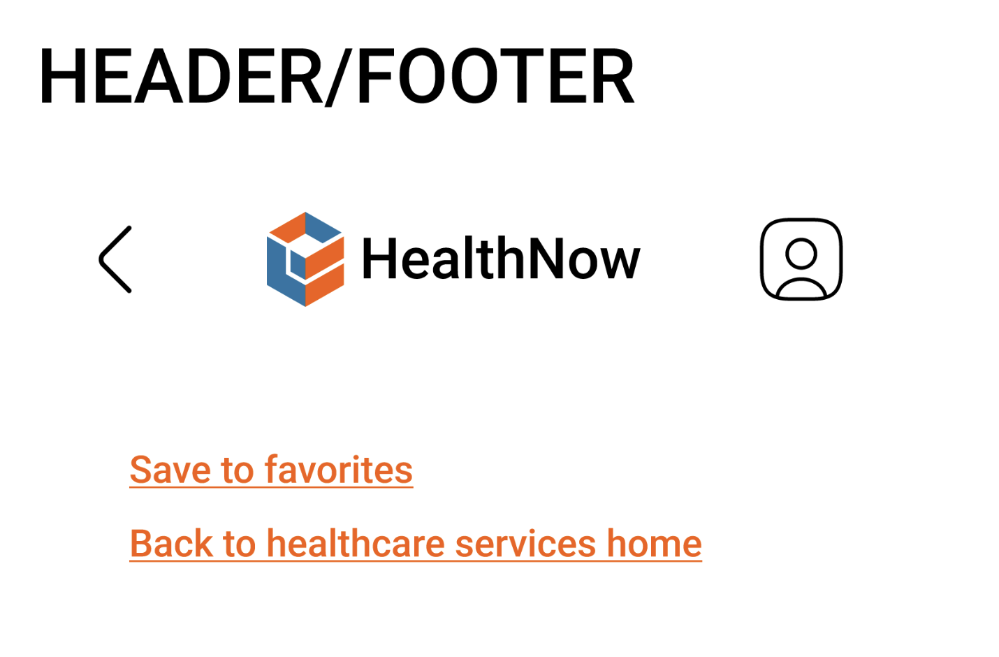
The user account icon on the initial Login/Create Account screens confused users. Since users need to either log in or create an account, the icon wasn’t live, so it was unnecessarily included on those pages in the initial design.
If users wanted to go back to the healthcare services homepage, every user utilized the back arrow, which had to be pressed several times. Users could return to this page by clicking the HealthNow logo on the top of the page, but they usually were trying to navigate back to this page after scrolling down a long screen of information for a provider. To make this process easier, I added a link that sent you back to the healthcare services page at the bottom of every provider screen.


High-fidelity Prototype
After making the changes from the usability study, I then moved onto my high-fidelity prototype.

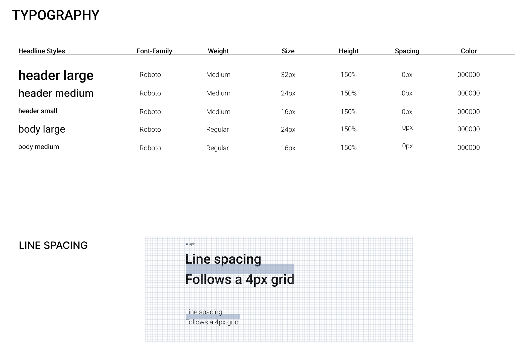
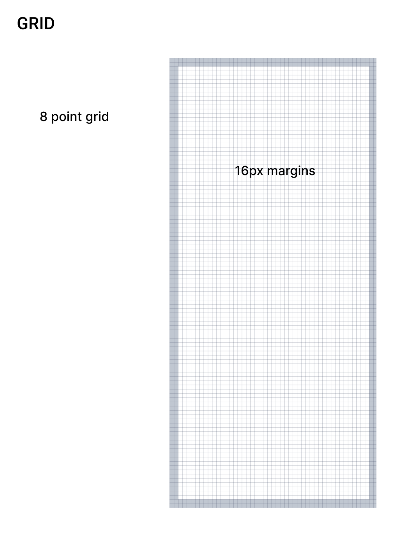
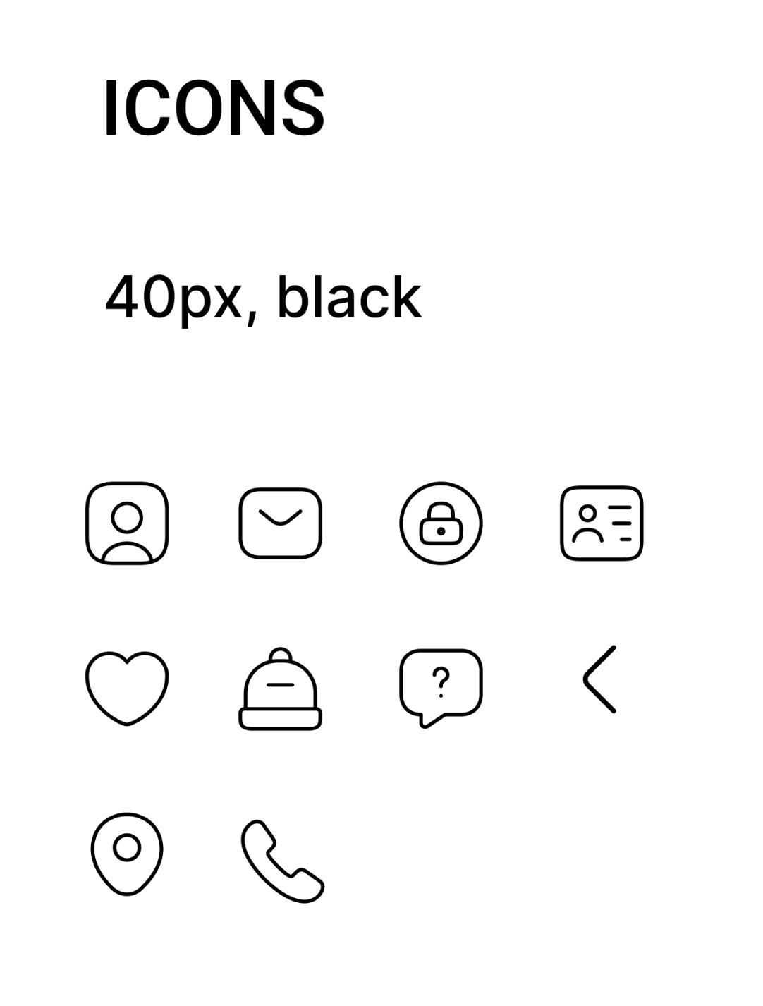
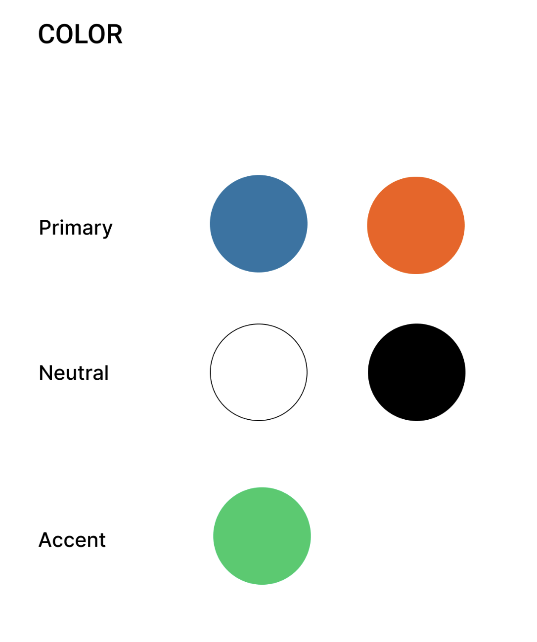
Visual Design
When deciding on the visual style of the app, I kept in mind that the UI of HealthNow needed to have clear visual hierarchy and not distract from the goal: helping Virginians find healthcare. Therefore, I decided on bright, accented colors against a white screen, clear bold text, and simple icons to enhance the user experience.

Next Steps and Takeaways
I had a lot of fun designing the HealthNow app and learned a ton. My main takeaway was how incredibly important it is to take your bias out of things, and do the research. Based on my initial assumptions, I was planning on making this a responsive website, but after my research, I learned that a website was not what was most beneficial for users (based on the data that more low income families access internet via their smartphone and don’t have home broadband). This was a really exciting finding, and challenged my assumptions! I’m really excited for future possibilities of the app, and would like to explore the following:
Have HealthNow available in as many languages as possible.
Have emergency hotlines integrated into the app.
Continue to expand app accessibility concerns for those with visual, auditory, motor, and cognitive disabilities.