Frontlines Platform
User Research | UX/UI Design | Figma | Sept - Jan 2026

Client: Frontline Ministries
Time Period: September 2025 - January 2026
Role: UX Research and Design
Team: Founders, 2 developers, and product owner
Challenge: Leadership struggles with fragmented systems (spreadsheets, disparate communication tools, ad hoc training) that do not support the relational and operational needs of missions work. As a result, critical care, support, and training often fall through the cracks, contributing to high attrition rates (66% leave due to spiritual health). There is a need for an integrated, mission-aligned platform to centralize care, training, pipeline management, and relationship tracking — freeing leaders to focus on the human side of missions rather than administrative chaos.
Solution: As the UX Designer for Frontlines, I designed a platform that transforms how churches and missions organizations care for their missionaries. Through research and iterative design, I helped build an integrated system that unifies care tracking, communication, and training within a single intuitive interface. This approach reduces administrative burden and makes proactive, holistic care possible.
With 66% of missionaries leaving the field due to weak support systems, there was a clear need for a simple, human-centered platform to help churches care for their people better.
Research Approach
The founder of Frontlines came to the project with a clear vision and firsthand understanding of the challenges churches face in caring for missionaries. My role as the UX designer was to translate that vision into a user-centered experience grounded in real needs and workflows.
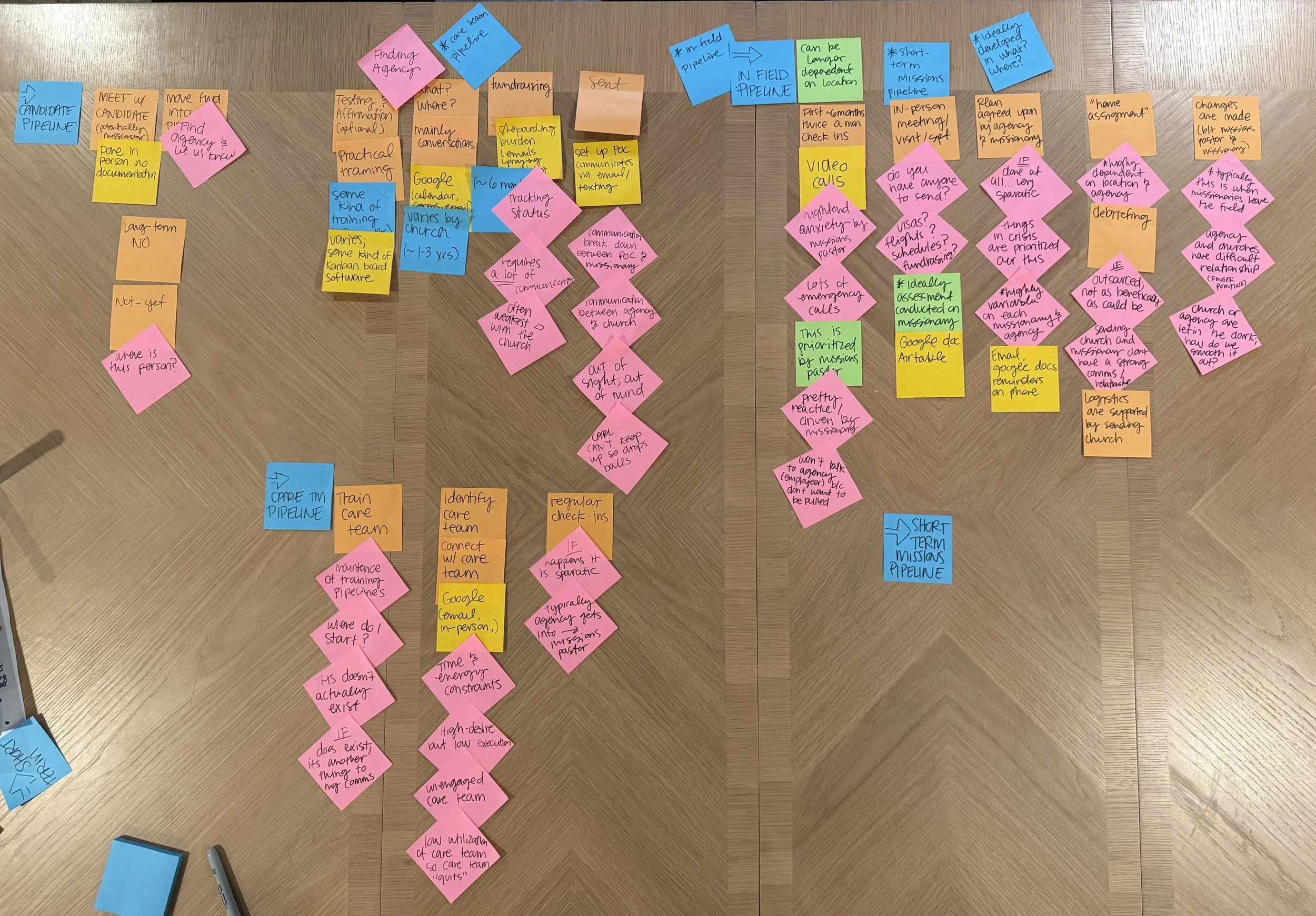
We began by mapping out the platform’s potential user groups to understand the broader ecosystem:
Missions Pastors – oversee missionary care, training, and communication.
Missionary Trainees – individuals preparing to serve overseas.
Care Team Members – volunteers who provide relational and practical support.
Administrators – manage logistics, reporting, and training resources across organizations.
Because of time and access constraints, our team prioritized the missions pastor persona for the initial research phase. This role sits at the center of nearly every process—from recruiting and training new candidates to maintaining care for missionaries in the field—making it the most strategic starting point for understanding the problem space.
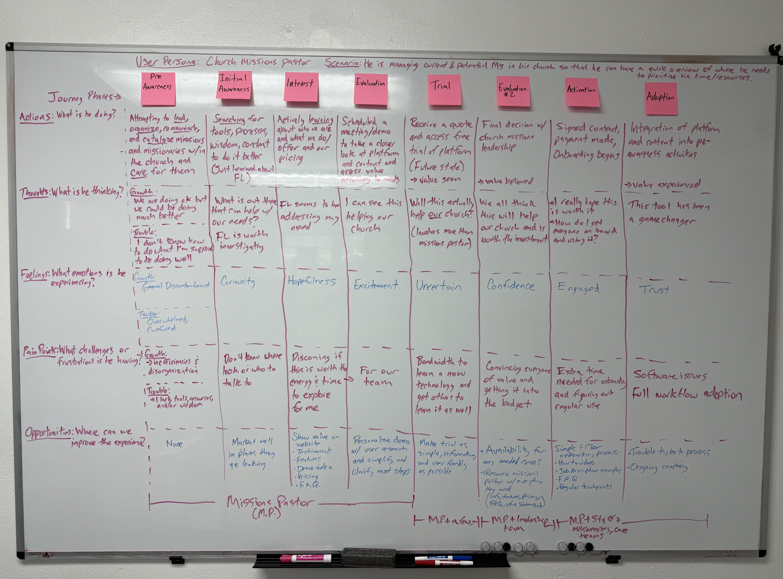
Journey Mapping
First we held collaborative sessions with the founders to map the missions pastor’s end-to-end experience, from identifying a new candidate to supporting missionaries in the field. This revealed where tasks broke down, communication was lost, and emotional burden set in.
User Interviews
Next we conducted an in-depth interview with a mid-sized church staff member to validate assumptions, uncover workflow gaps, and understand the emotional realities of balancing relational care with administrative demands.
-
Most responsibilities are handled through emails, spreadsheets, and Google Docs, with no centralized system.
Chris often loses track of where candidates are in the pipeline, admitting, “I just find it in my email.”
He wants a formalized, repeatable process to gather and track basic information about missionary candidates.
Design implication: The platform should establish a clear, guided workflow that replaces ad-hoc systems and helps pastors feel confident they’re not missing anyone.
-
He struggles to know whether missionaries are being contacted regularly: “I wonder if anyone has touched base with them.”
There’s no easy way to see when a conversation last happened or what was discussed.
Care is “organic,” relying on fellowship groups rather than structured follow-up.
Design implication: Introduce simple contact logs, reminders, and visibility indicators that show the health of each relationship without adding bureaucracy.
-
Administrative tasks—applications, trip details, and communication—take time away from meaningful connection.
He described missions work as “a sprint,” done in chunks between other pastoral duties.
He wants to ensure processes don’t replace personal interactions: “I’d stop using it if it made things impersonal.”
Design implication: Design tools that simplify logistics while keeping the relational aspect front and center — for example, through personal notes, prayer tracking, or gentle conversation prompts.
-
Each short-term trip requires reinventing forms and workflows, such as applications, prerequisites, and decision tracking.
He envisions success as “being able to open the tool and have a workflow.”
Design implication: Build templated, reusable workflows for recurring tasks like trips and candidate pipelines to save time and improve consistency.
-
He feels the greatest weight in not keeping up relationally with missionaries.
He worries that the care system doesn’t reflect the value of the relationships it’s meant to nurture.
Design implication: Design for peace of mind — help pastors feel confident that every missionary is seen, prayed for, and supported through intuitive dashboards or gentle reminders, not more admin tasks.
Site Map
To organize the platform and clarify user journeys, I created a site map that outlined the full structure of Frontlines across all four user types — missions pastors, care team members, administrators, and missionaries-in-training.
Each page in the map was tagged with an icon representing its primary user, making it easy to see which parts of the system overlapped and where unique functionality existed.

Early Wireframes
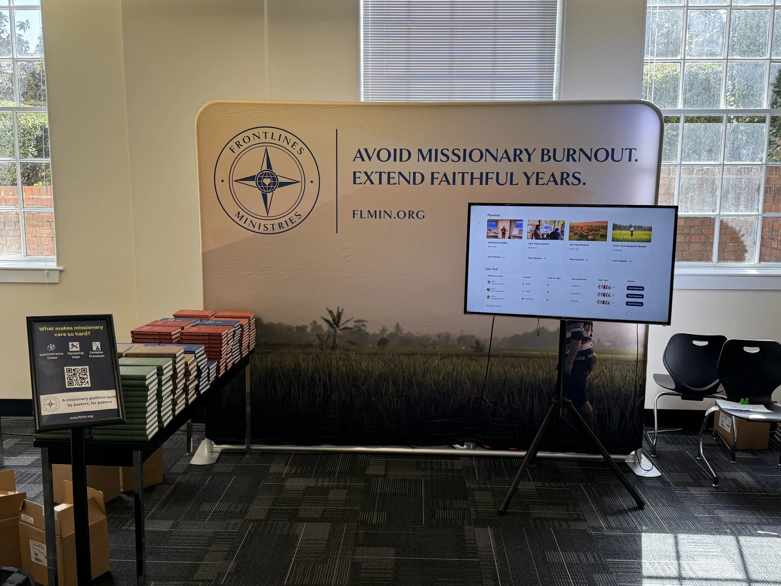
Early in development, the platform was structured more like a traditional website. After reviewing the content and user workflows, I recommended pivoting to a dashboard layout. Because users will often manage multiple information flows, a dashboard would allow them to see everything in one place, easily switch contexts, and prioritize tasks without excessive navigation. I knew there would always be multiple moving parts, so I prioritized a layout that let users understand the big picture at a glance, with key metrics surfacing immediately and tables providing instant visibility into multiple users.


Because the platform needed to be presented at an upcoming convention, I I focused on producing high-fidelity screens quickly to communicate the product vision and spark interest from potential partners. These visuals were designed to look and feel real — showing how the platform could unify pipelines, streamline care, and bring relational visibility to the work. The goal wasn’t to prototype interactions, but to give stakeholders something tangible and inspiring they could confidently share.
Rapid Design for Early Buy-In
High-Fidelity Designs
I incorporated key brand elements to ensure the design reflected the organization’s visual identity while maintaining strong legibility and WCAG 2.1 AA (50) color contrast compliance for accessibility. Because the development team was building the platform with Tailwind CSS, I used the Tailwind UI kit to keep components consistent with their framework and accelerate handoff. This approach allowed the final screens to balance brand personality with practical implementation — ensuring the design was not only visually cohesive but also ready for development.


